CASE STUDY 01
freshlove
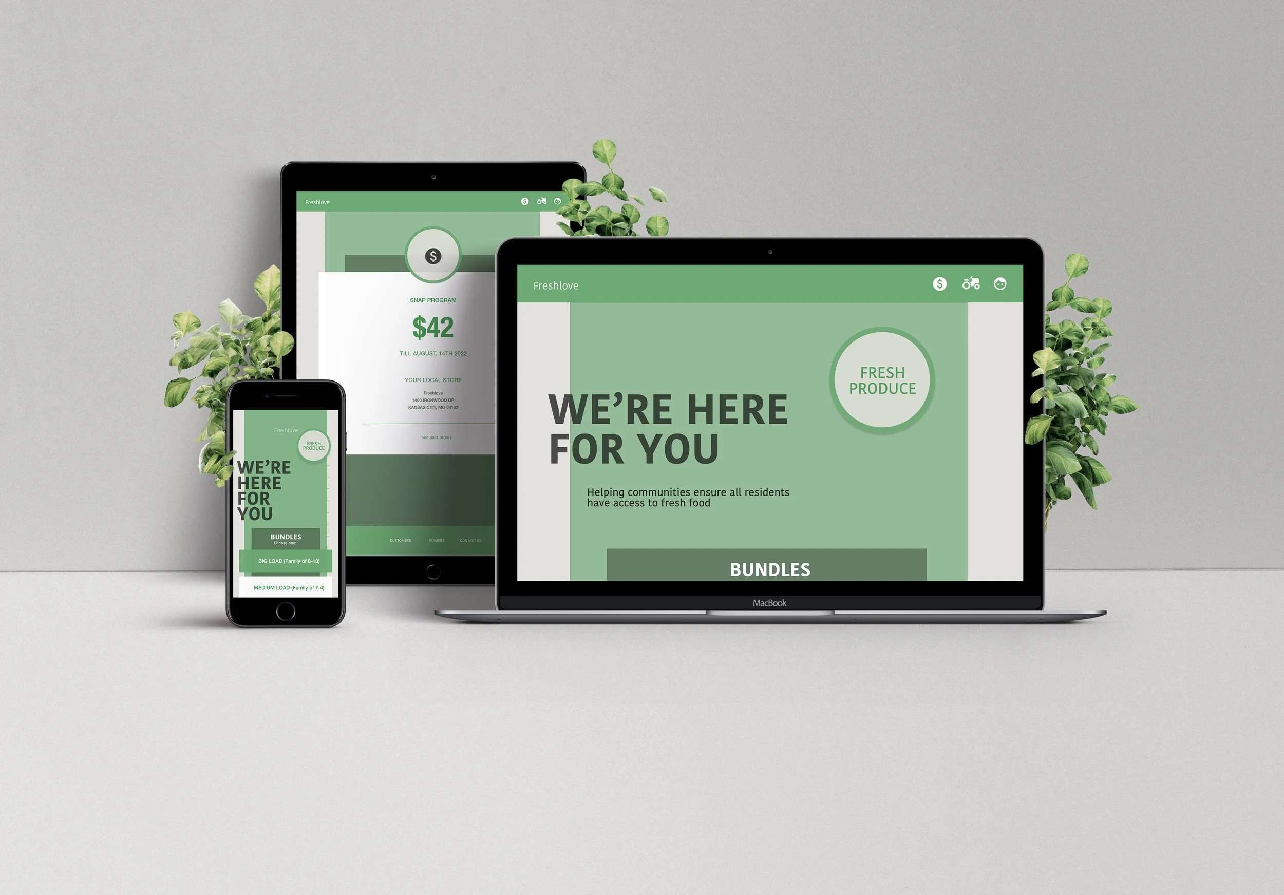
Presented as both an sequential model app and responsive website. This design is geared toward low income families, with the goal of ensuring all local residents have access to fresh food from local farmers’ harvests.
DURATION
JUNE 2022-JULY 2022 (3 weeks)
MY ROLE
Team lead, visuals & interaction
RESPONSIBILITIES
Personas, empathy map, user journey, problem statement, user research, crazy eight and ideate, competitive report & audit, user flow, wireframing, storyboard low-fi & hi-fi prototyping, site map, final design
The problem
Lower income families have an overwhelming amount of over processed food available to them with hardly any fresh food options that aren’t expensive. We are rethinking the process behind the fresh food supply chain.
The goal
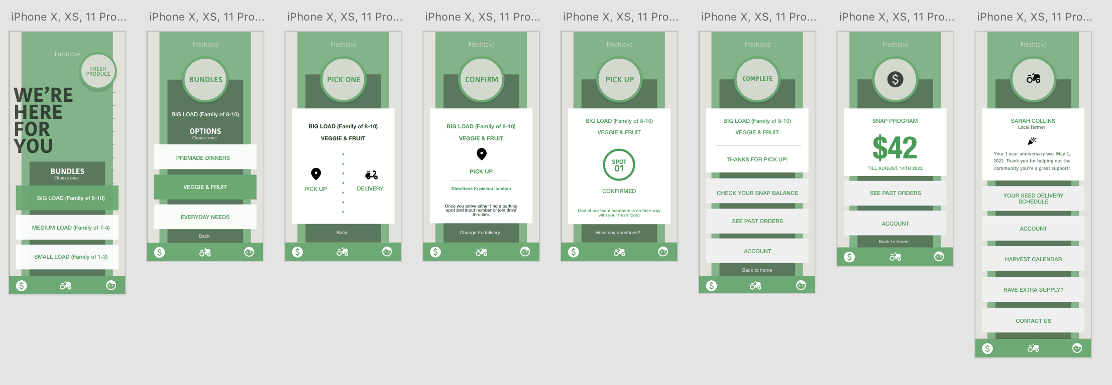
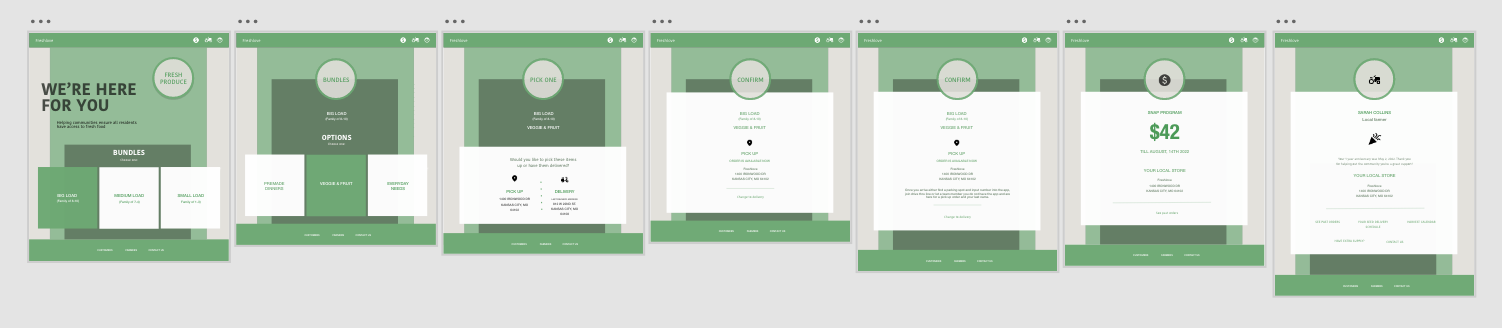
The users of this app are provided fresh food options from an easy, guided, user experience. The food is available as bulk items that are available during that time of year. Any farmers out there? Do you have a green thumb, always giving away your zucchinis and tomatoes? Or have you always wanted to get started in gardening and have the available outdoor space for gardening? Help out the community with your skills! With funding from a government program, we hire local farmers. Potential farmers complete a certificate program online covering the everything to do with the gardening process. The program is a 6 month self guided certificate program online. Once potential farmers receive a certificate, they can get started on their first harvest for the community! Pick up locations and delivery are available.
For the freshlove user study
We wanted to make sure we consider accessibility and our users journey. We chose a diverse group for the user study to find new findings. We chose our target audience for the user study which is low income households including diverse and LGBT families, individuals of the older community and young adults. We conducted a unmoderated study, where the individual filled out a questionnaire. I conducted user interviews on the phone, which I then turned into empathy maps to better understand the target user and their needs. Finding that low income families find single page is an easy experience and like to try out the variety of fresh food they recieve. Our farmers use the app to keep track of seed shipments, harvest calendar and account and use less often. Buying fresh food continues to be very expensive and the supply chains supply grocery stores with all options all the time. We discovered this overwhelming and too many choices to and options, which sounds nice but turns into confusion challenging to decide.
“I need a way to quickly access to fresh food for me and my girls.”
Problem statement
Rachel is a mom who needs a quick and easy way to get fresh food without having to fill out a long grocery list or go into store to choose items and get the items I need to feed my family.
Goals
Low income/snap program saves users time and money
Community outreach
Frustrations
Katy is a divorced mom of 2 and daycare owner who needs a quick and cost effective way to access fresh food because she has a busy life and is tired of feeding her kids over processed fast food at a cost effective price.

Katy
AGE 34
EDUCATION Associates degree
HOMETOWN Irvine, CA
FAMILY 2 kids, divorced
OCCUPATION Daycare owner
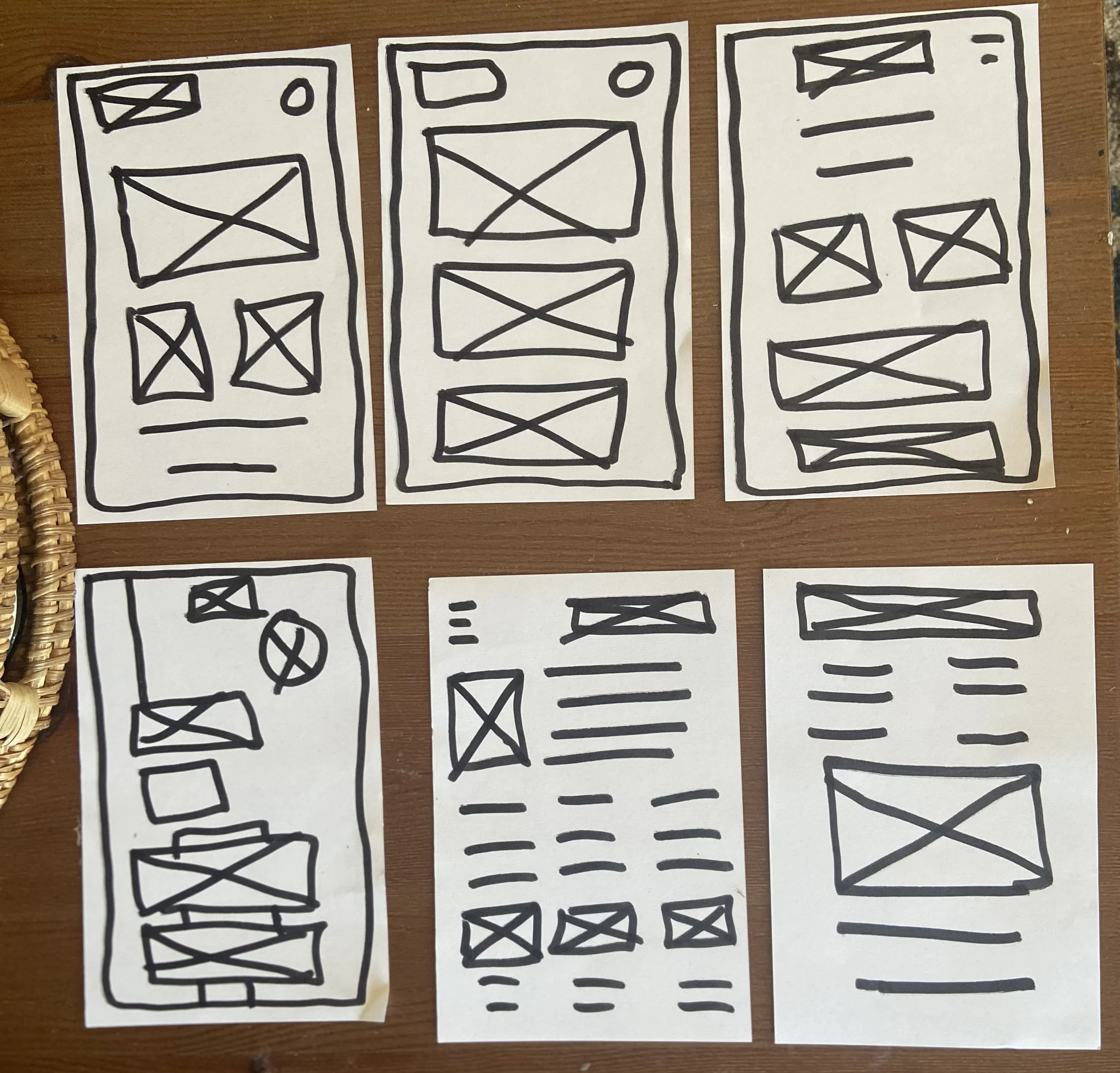
Sketches from the homepage wireframes below.
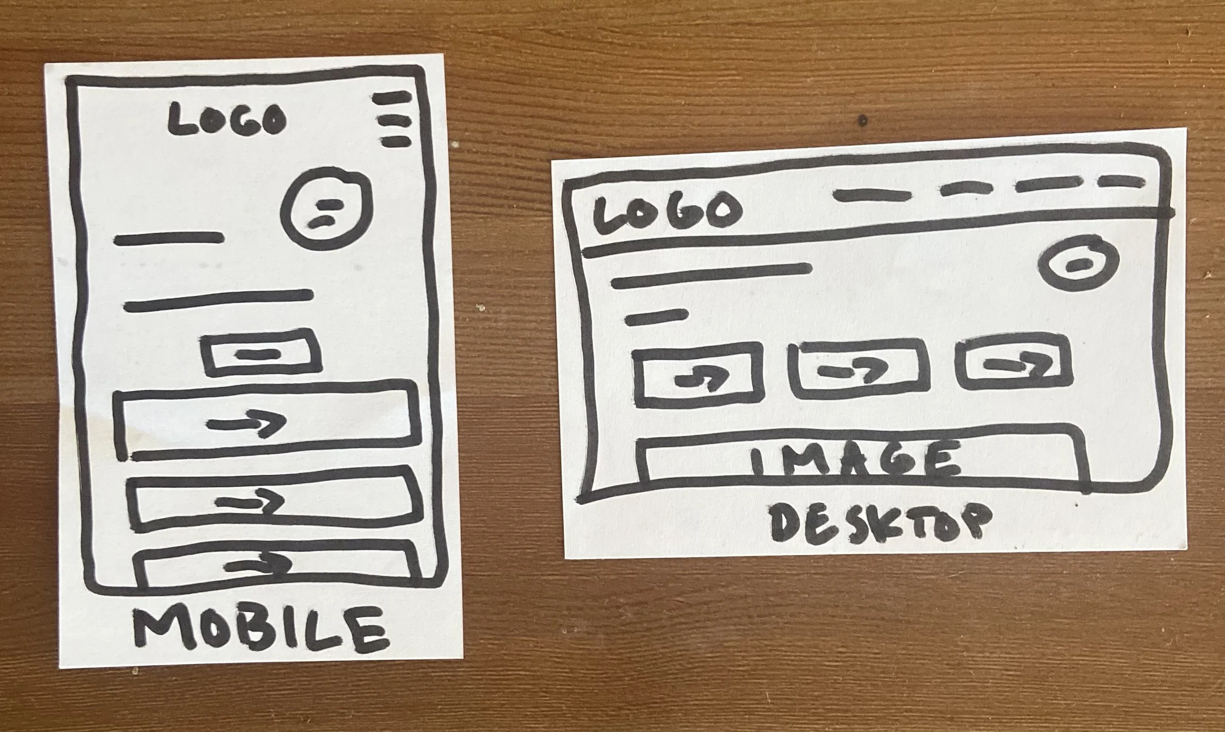
Early sketches and paper wireframes and planning the responsive design.

Crazy eights
Competitive audit
The goal of this audit was to see what Feeding America and Walmart do for the communities with fresh food. Feeding America who is a company that supplies for for low income families and the community. Walmart has a large amount of fresh food available with lots of options and selections. There isn’t a user experience that does require a lot of input on the user’s end ordering to get fresh food easily and cost effective.
I think we have an opportunity to change the mindset of the company is to care about the process and provide the freshest food available. Providing a user experience that is intent is for good whole heartedly to shine through and created different perspectives on how things are made and process to get there.
Usability study parameters
Study type Moderated usability study
Participants 5 individuals
Location United States, Kansas City, Mo
Time length 10 minutes
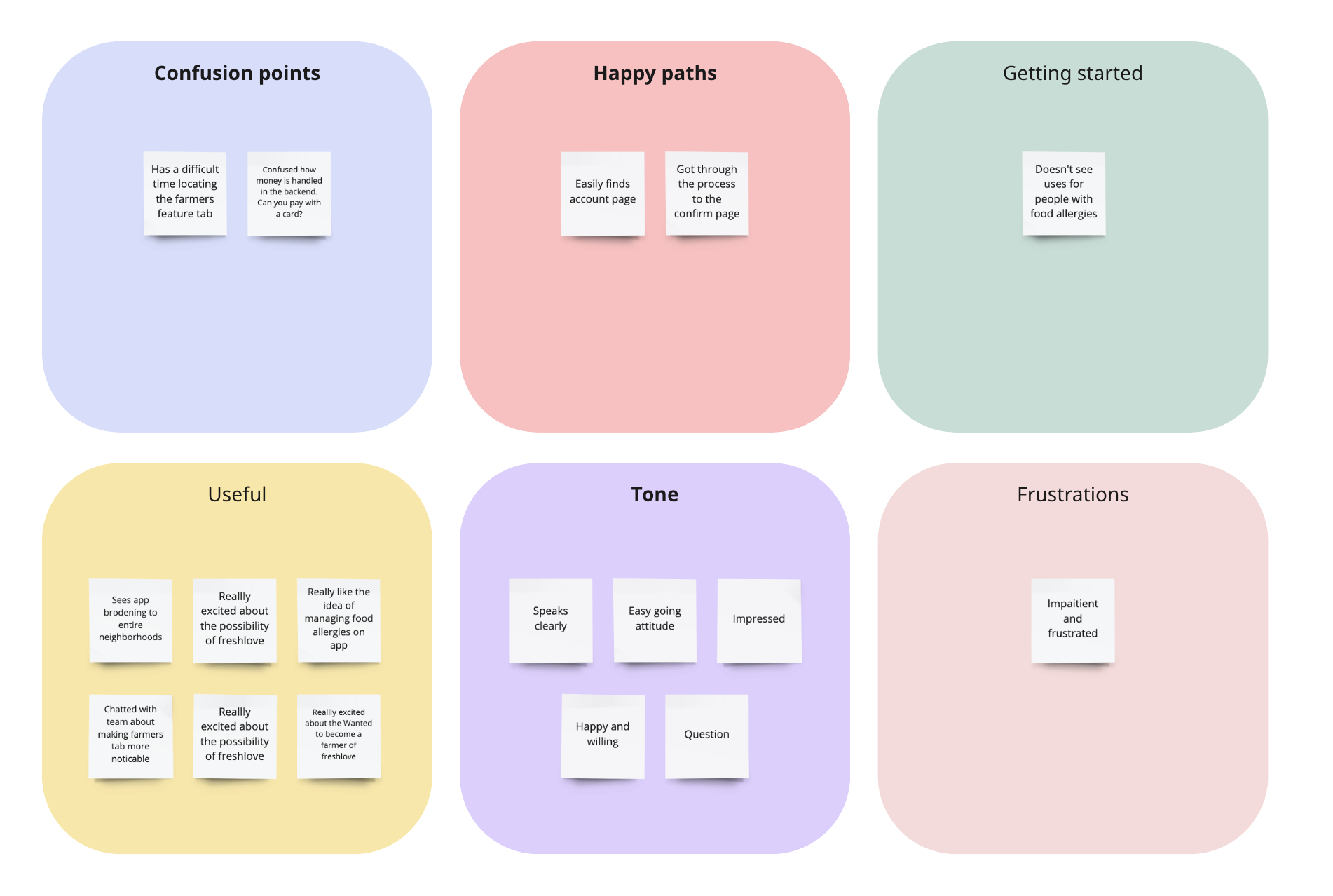
Affinity Diagram

low-fi prototypes
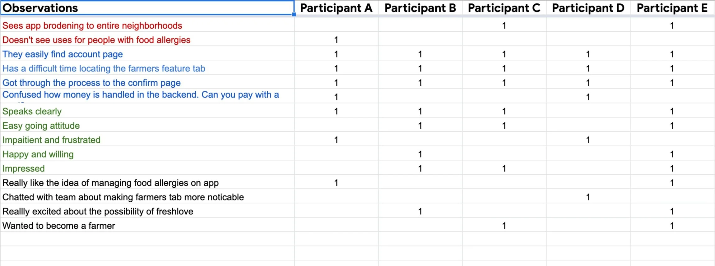
Primary research was conducted by me then I created a user study moderated in person. The interview was a quantitative study and included 5 participants. I measured the click path, observations, quotes and if they completed the task. I did this to understand the user behaviors, needs and motivations through observation and feedback. Then I expand themes that compiled and expanded into insights. Some KPI indicators that evaluated the process were time on the task and system usability scale.
The goal was to figure out what the user needs and how to address those needs and hopefully inspire new design directions. This helps me empathize with users.
Sarah was confused how to become apart of the program how snap vs our member program all worked in the flow. How can we do special order for people with food allergies like Fred. We were pleasantly surprised lots of people are interesting in the farmers program we noticed from our survey monkey report.
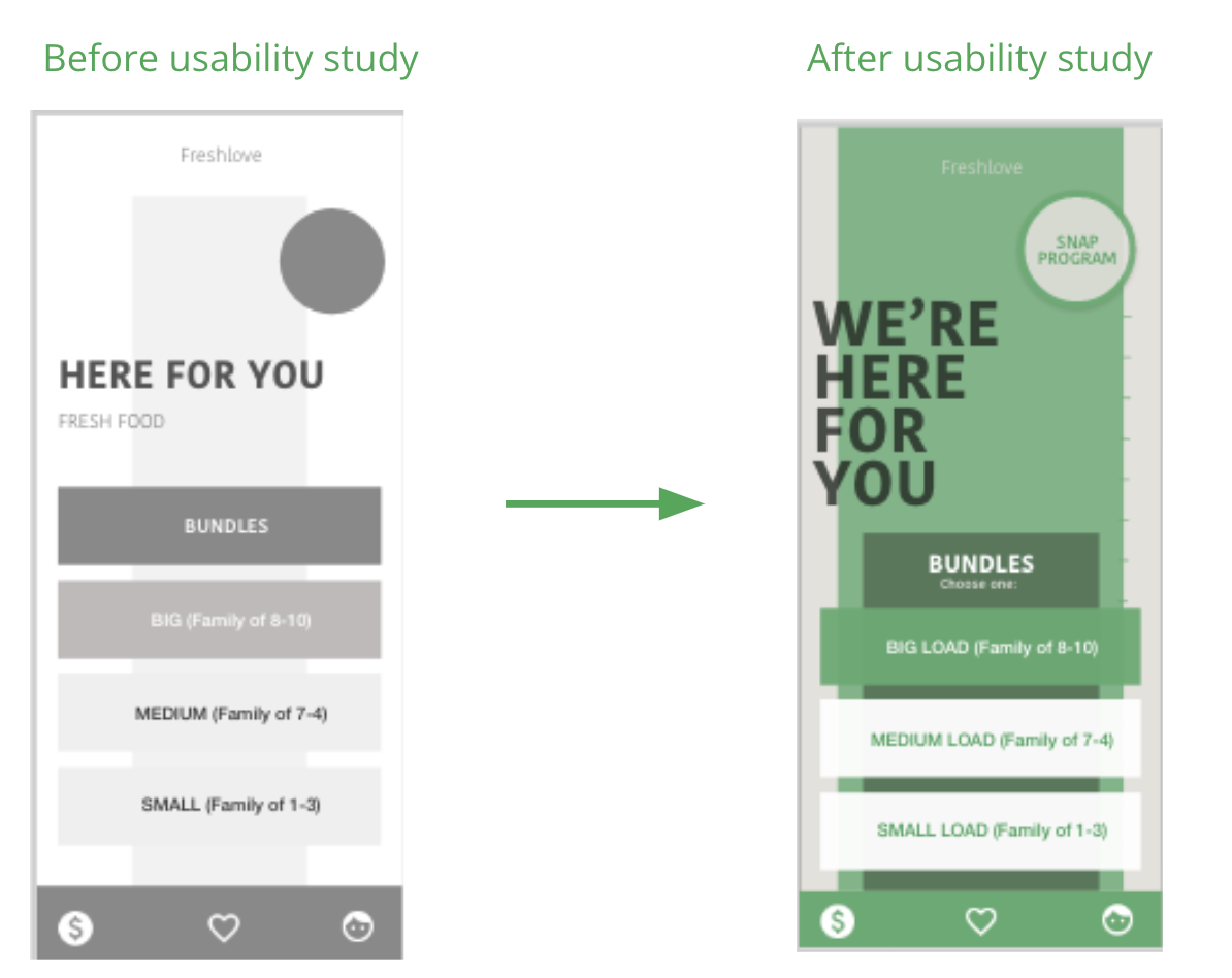
Based on the insights from the usability study, I made changes to improve the site’s flow. This allowed users more freedom to browse site without going through a complicated process.
Usability study
Takeaways and Results
Our target users shared that the design was intuitive to navigate through, more engaging with the images, and demonstrated a clear visual hierarchy. I also kept in mind the 4 C’s and used consistency for look and feel, which is keeping a uniform design so users can expect the design to feel familiar across devices and products.
I learned that even a small design change can have a huge impact on the user experience. The most important takeaway for me is to always focus on reality-based needs of the user when coming up with design ideas and solutions.
NEXT STEPS
Conduct follow-up usability testing on the new website.