Case Study 02
Garmin Support centerAs the lead designer, I helped create the brand new responsive website experience for users of Garmin products seeking online support
I was brought on to this at the beginning of the digital support center, we worked in 2 week sprints with the development team. On the project I worked as the lead designer for this brand new web experience planning user flow and overall design. The goal was to get less calls and more answers taking the users through an experience that ensures they finds the answers for Garmin customers quickly. During this design process, I created the user journey, wireframing, site map, designed template for final design that was used for search product pages.
Duration
JUNE 2017-JANUARY 2020
My Role
Lead designer who was a part of a team alongside a data analysis, and an information architect.
Responsibilities
User journey, user research, user flow, wireframing, site map, final design, updates after MVP launch
The problem
Garmin Ltd. support center was only available by phone, email and in person at our Olathe Headquarters. With the new technology, Garmin wanted to offer support in new faster ways.
The goal
To have a complete support team that answers calls, emails and now chat and while helping guide users to answers about Garmin products.
Timeline
The team was given 2 weeks to brainstorm ideas and start intal design process. I worked on wireframes and user flows with information architect while data analysis explored & researched. We would meet everyday and go over our findings until the project was completed.
Secondary research and competitive audit report
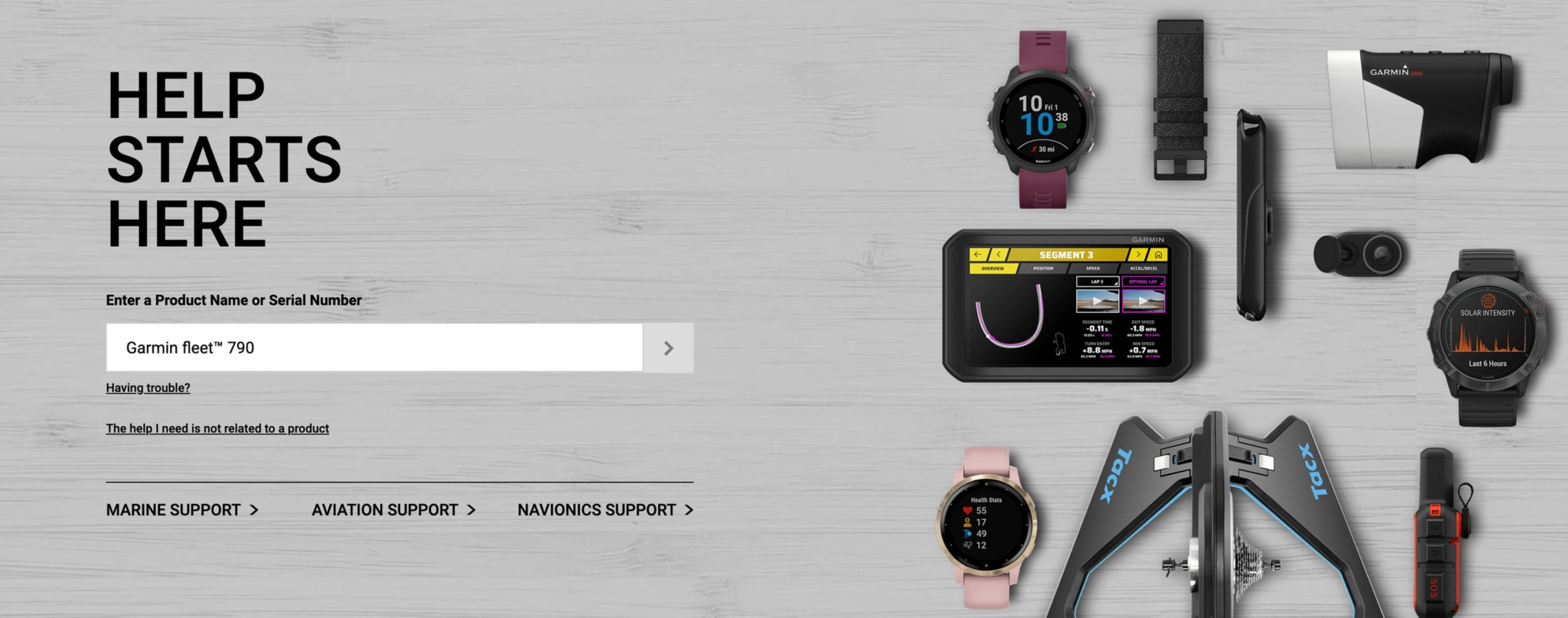
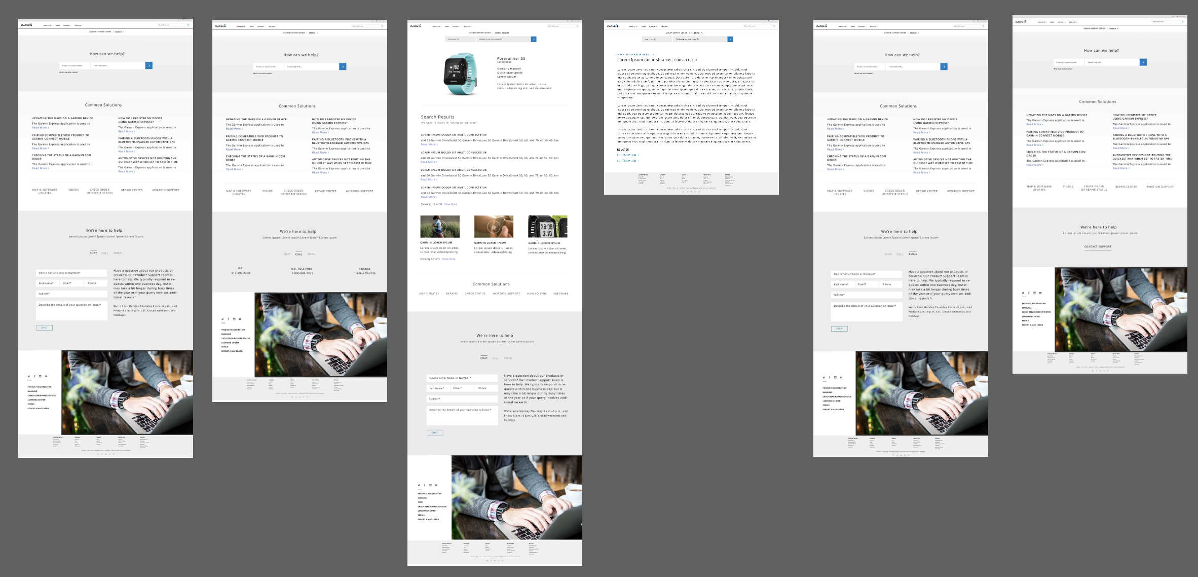
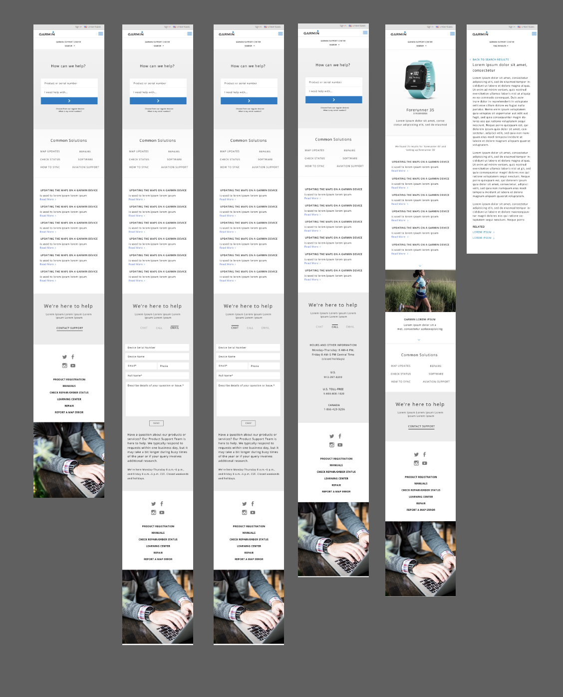
Much of our time was spent on the search method for ‘Help Starts Here’. We determined the best approach was to ask the user to provide the name or sku of product. We analyzed what users typically put in the search bar and issues users came across when search for the buy product page. Much of the time the user forgot product name or the keywords mostly used were ‘Garmin’ and ‘Gps’ with product name. Garmin offers various versions of a product so distinguishing between them somehow was key. To to guide the user to the correct support product page, we planned ‘enter product or sku’, with a drop down that helped guide. The user then selects which product that then directs them to the search product page. If they are having other issues like not knowing product name we offer links under the search bar. These links are ‘The help I need is not related to a product’ and ‘having trouble?’. We also conducted a competitive audit report on sites like apple.com and samsung.com support.
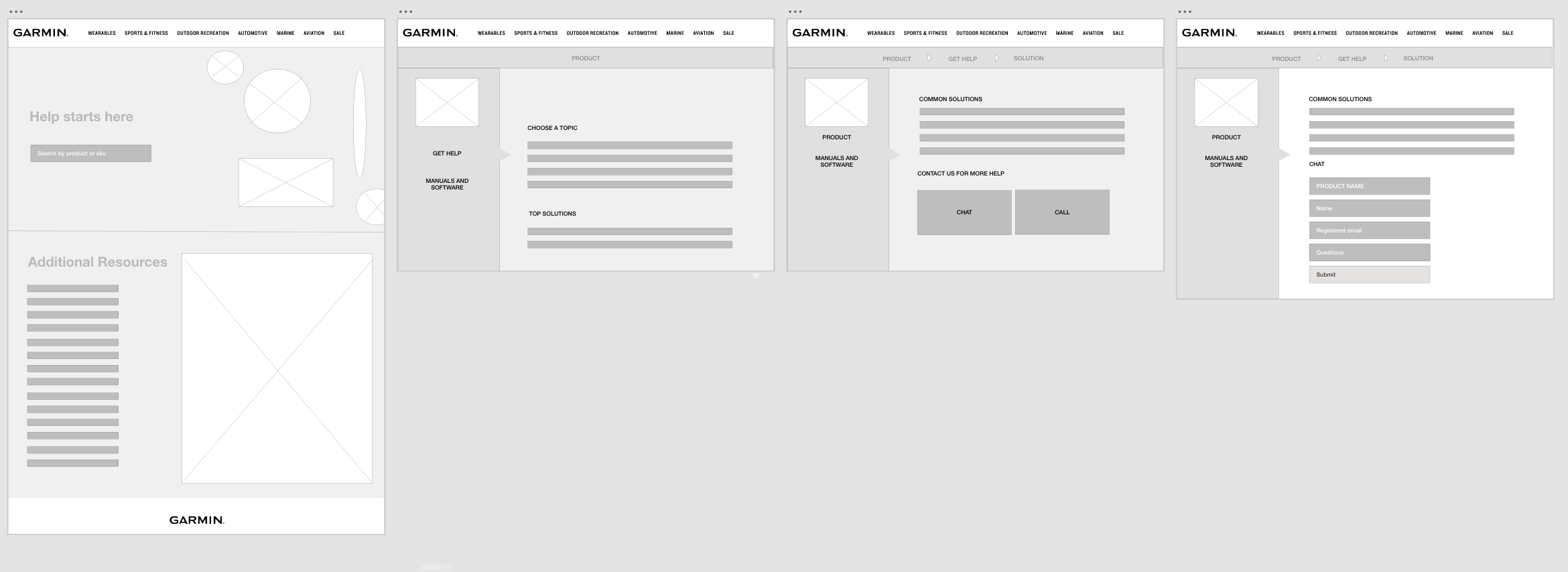
Wireframes
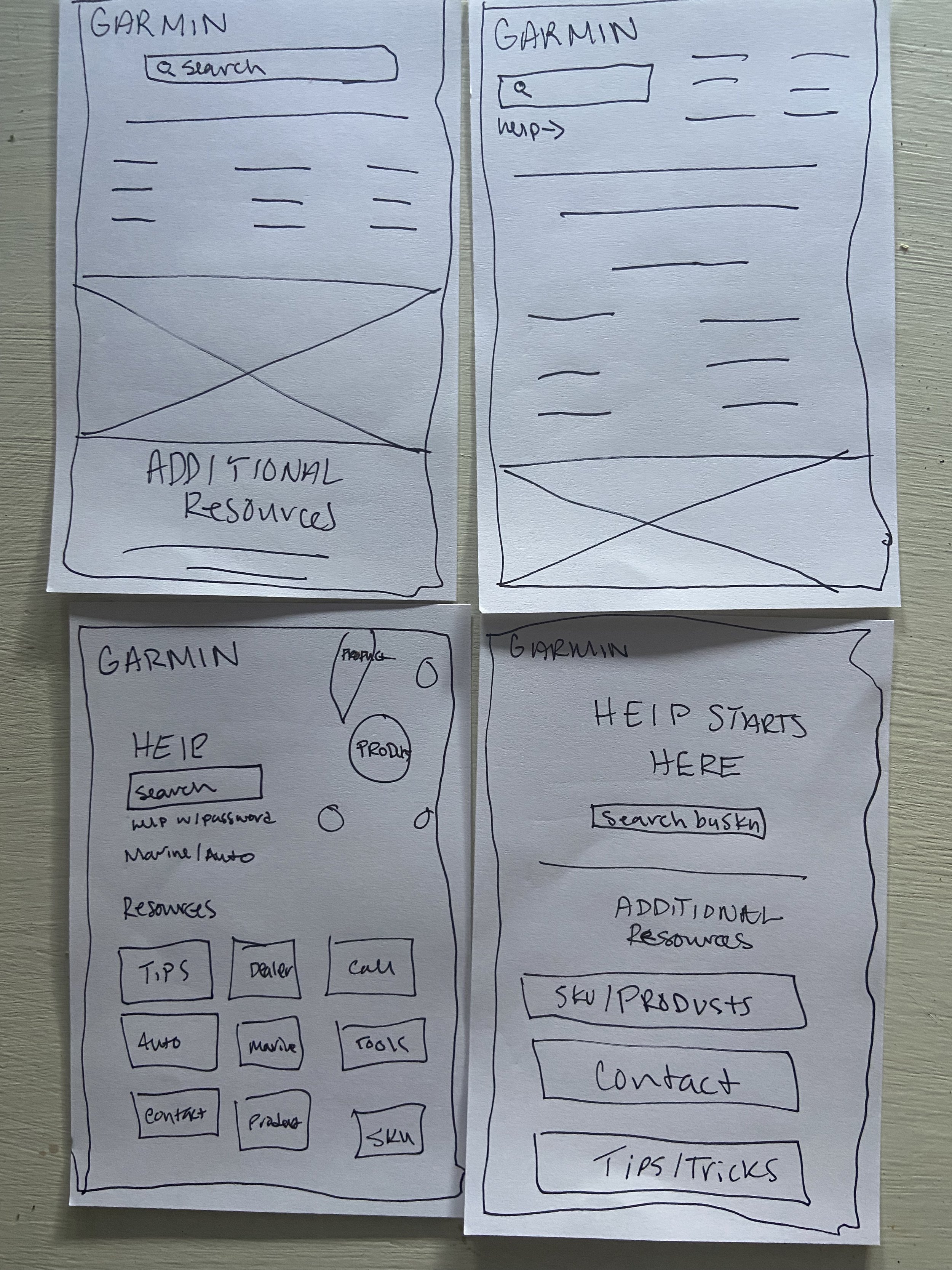
Homepage wireframe sketches
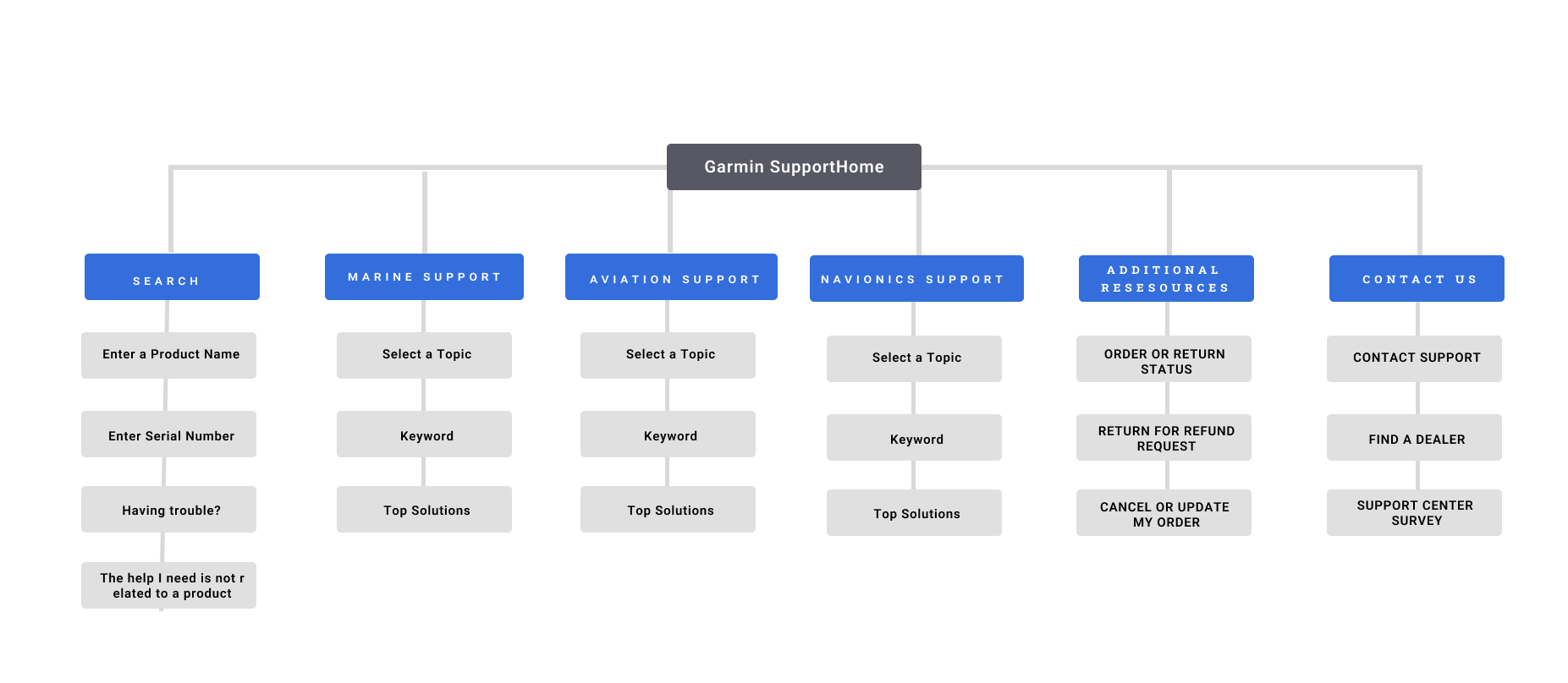
Site map
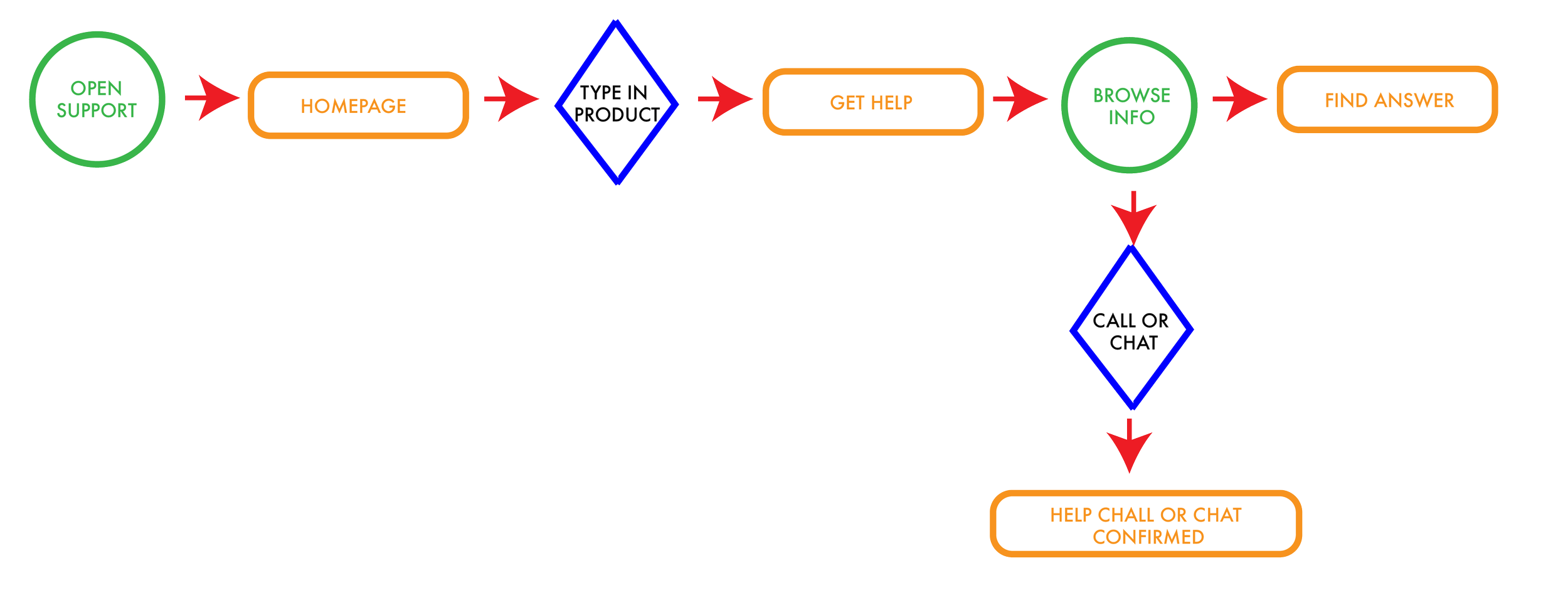
Example of user flow
User flow desktop
User flow mobile
Deliverables
Search bar - used to find, by product, the supporting product page. Once the user lands on the product page they have all the useful manuels, FAQ's and information pertaining to that product. If the user is still unable to get their answer, a form provides what services are available for users and what options they have to get in touch with Garmin Support. Adding the online experience is an attempt to bring down support calls with the addition of chat and email services.
Outcomes
Designed an online support center that works from a search bar that the user can search by to get help on services and products Garmin provides. This also included a template that was used on search pages. The product page has information on manuels, FAQ's and contact support. We got confirmation the call volumes are down and more users are using our online experience.
Check out site here.