

Used across +2,000+ product pages
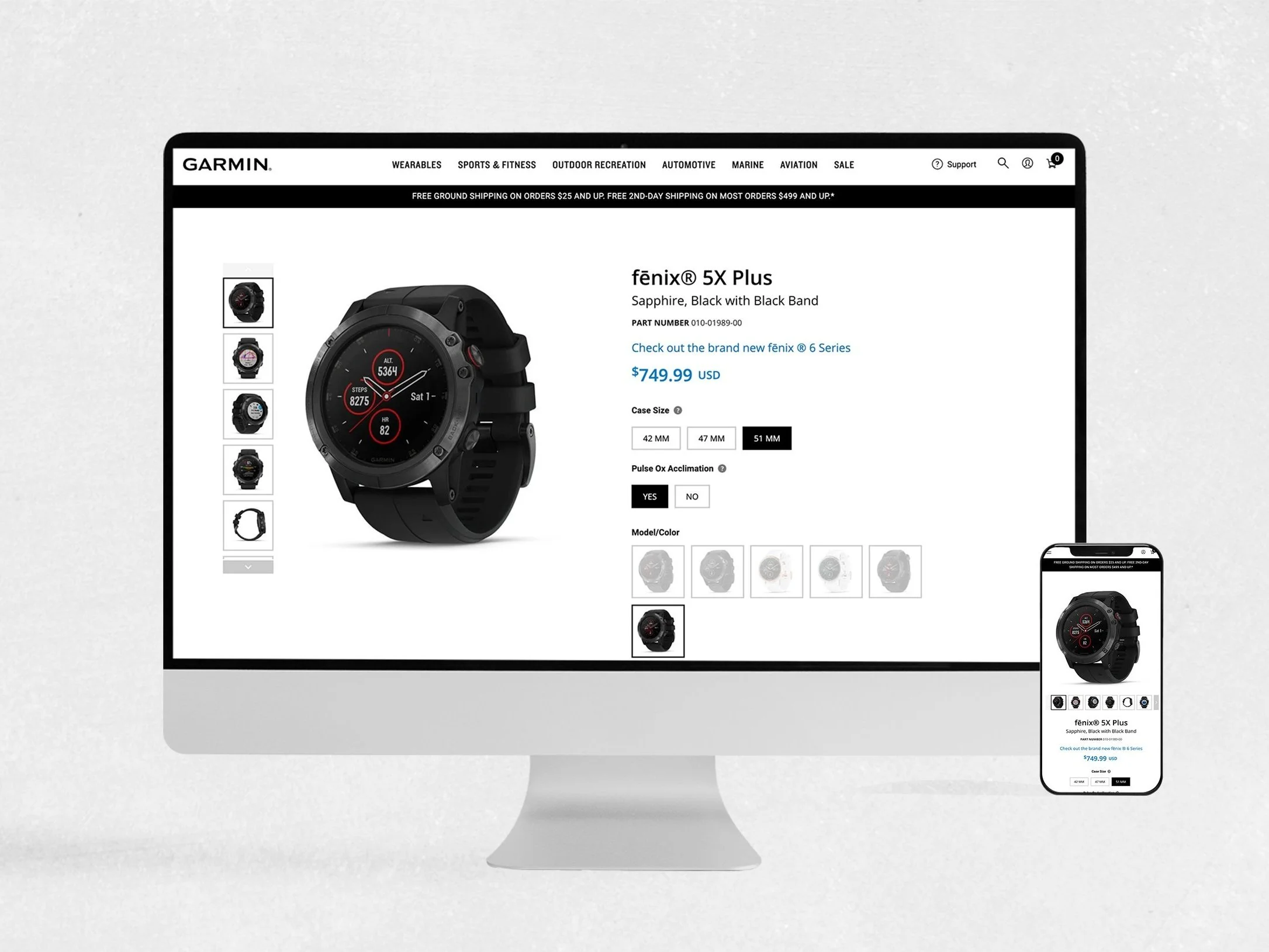
Garmin’s Responsive Site
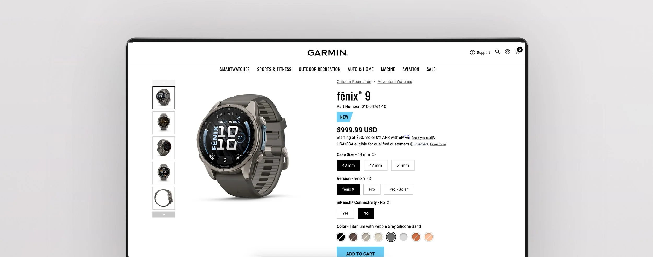
I led the design of Garmin’s responsive product pages, from wireframes and page layouts to high-fidelity mockups and prototypes. I designed reusable AEM components, including image carousels, product tabs, and filtering features, to create a consistent shopping experience and help customers easily explore product features and compare devices.
Role
UX/UI Designer
Focus
User research, prototyping, usability testing
Plateform
Desktop and mobile web
Project summary
Working within AEM, we developed a reusable component library and redesigned Garmin’s static product pages. Through user research, competitive analysis, and iterative prototyping, I explored how customers discover, evaluate, and compare devices, simplifying complex product information to make key features easier to understand and purchasing decisions more
Our Goal
Redesign Garmin’s product pages to simplify complex product information, improve product discovery, and help customers confidently compare devices and make informed purchasing decisions. Create reusable AEM components to ensure a consistent, scalable experience across 2,000+ product pages.
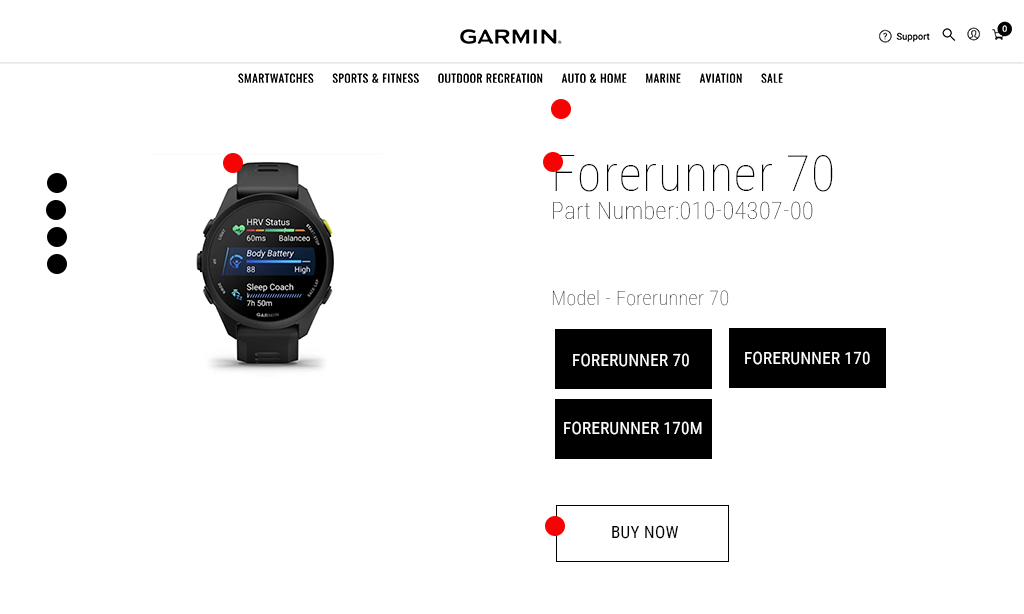
What’s the Problem?
Users struggle to navigate Garmin’s product pages, understand complex features, and compare devices efficiently. Dense content, unclear product differences, and difficult-to-find information create friction in the decision-making process, leaving users overwhelmed and less confident when choosing the right product.
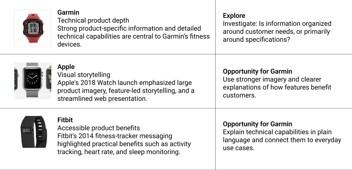
Competitive analysis
I evaluated e-commerce design patterns across Garmin and competing wearable brands to identify opportunities to improve product discovery and decision-making. The analysis focused on information hierarchy, feature clarity, product comparison, and purchase confidence. The findings informed opportunities to simplify technical content, strengthen visual storytelling, and create a more intuitive product-page experience that helps customers find the right Garmin device.
User Interviews

First-time buyer
“I started looking for a running watch because I wanted to track my pace, distance, and progress. I searched online and started looking at Garmin because people seemed to recommend it for running.”
Interview topic: Comparing models
Existing Garmin user
“I already know what I need from my watch. I just want to understand what's new, what's different, and whether upgrading is worth it.”
Interview topic: Understanding features
Interview topic: Purchase confidenceBrand comparison shopper
“I want to compare my options in one place and understand which watch gives me the features I actually need.”
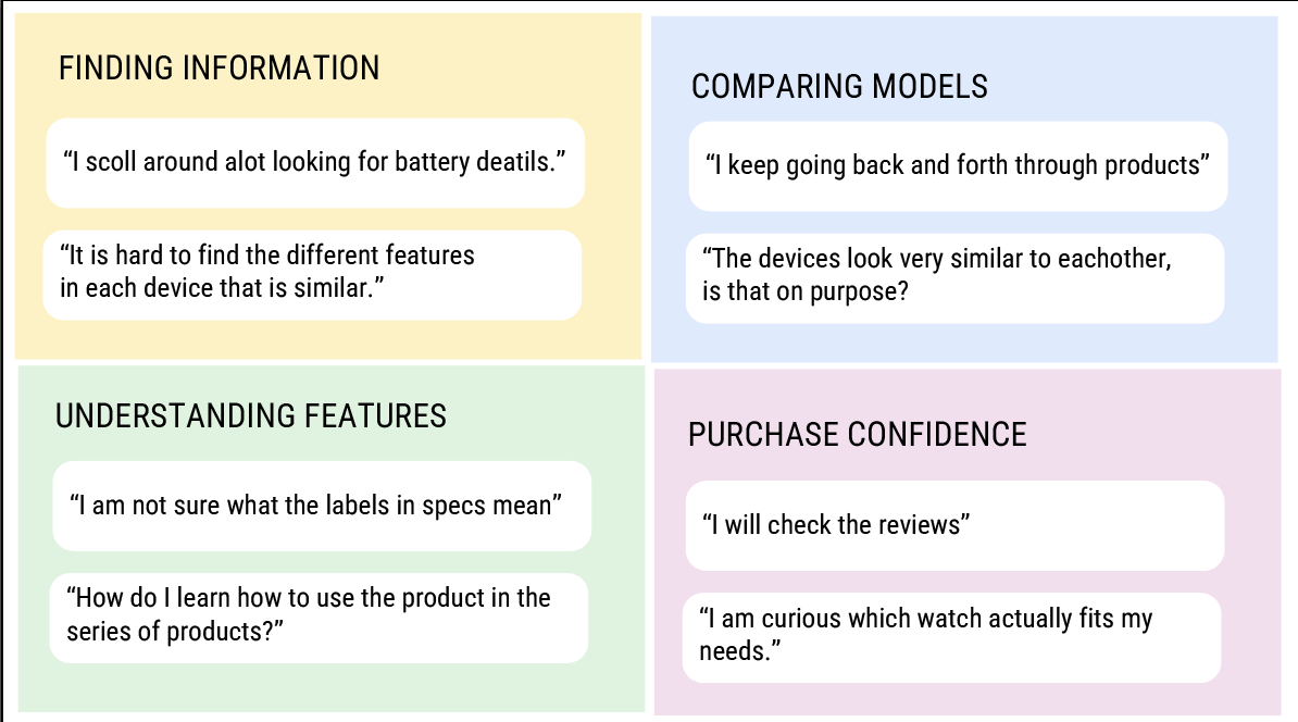
Understanding the Garmin shopping experience
To understand how customers research and evaluate Garmin devices, I conducted user interviews focused on shopping behaviors, product discovery, feature comprehension, and model comparison. The interviews explored how users navigate product pages, identify relevant specifications, and build confidence in their purchasing decisions. I synthesized the findings into recurring themes and design opportunities that informed a clearer, more intuitive product-page experience.
UX research
Semi-structured interviews ·
30 to 45 minutes
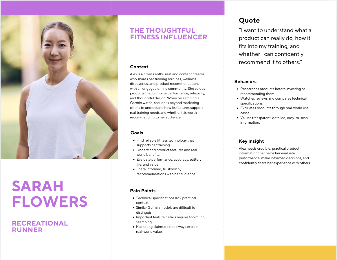
Who is the user?
Alex is a fitness enthusiast and content creator who shares her training routines, wellness discoveries, and product recommendations with an engaged online community. She values products that combine performance, reliability, and thoughtful design. When researching a Garmin watch, she looks beyond marketing claims to understand how its features support real training needs and whether it is worth recommending to her audience.
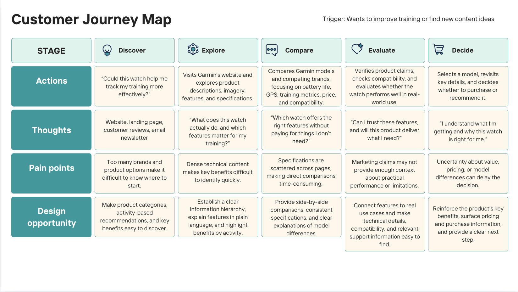
Customer journey map
For me, great UX comes from great collaboration. Working across many teams, I focused on creating an environment where people felt heard, supported, and comfortable sharing ideas.
I believe appreciation helps teams do better work. I’m generous with praise when something works, and when it doesn’t, I try to stay calm and focus on improving the idea together.
That approach helped us build a strong product experience by balancing impactful imagery, simple UI, and clear content while bringing different perspectives together.
Outcome
Designing at this scale changed how I approach product design. Instead of focusing on perfecting a single page, I focused on building a flexible system that could deliver a great experience across thousands of products.