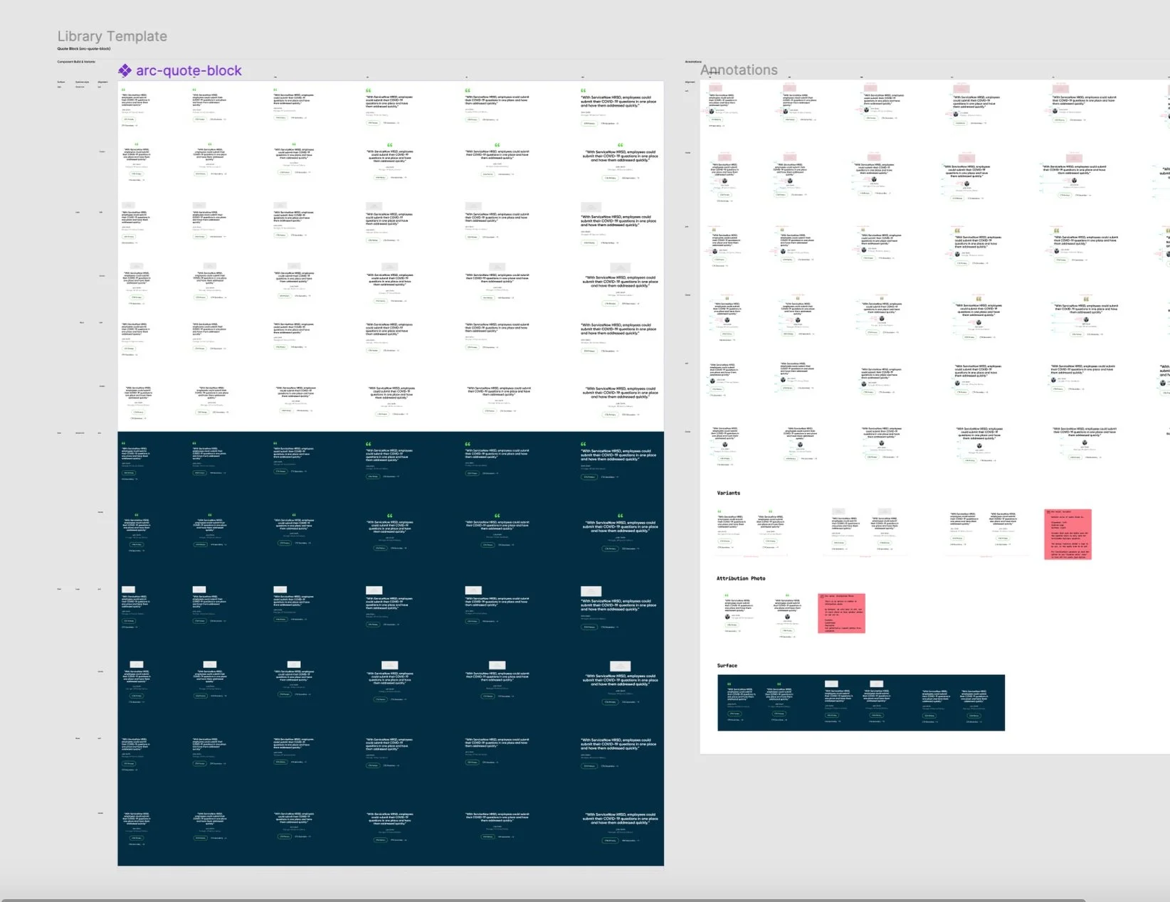
Designing a scalable logo component for the ServiceNow UI library
I worked on ServiceNow’s design system, focusing on the Logo Block component to make logos feel more consistent, flexible, and easy to use across the homepage
Role: UI/UX Designer
Focus: Design Systems, Component Library, UI Design, Responsive Design
Deliverable: Reusable Logo Block Component
ServiceNow ContextServiceNow is a big platform used by all kinds of people—from IT teams and employees to developers, admins, and customers. That means the experience needs to work for very different people, workflows, and needs.

Creating Consistency at Scale
My focus was creating a flexible, reusable Logo Block that made logos feel more consistent across ServiceNow.
The challenge was simple: How do we give every logo the right visual weight while making the component easy for designers to use?
I explored different layouts, spacing, and alignment through iteration, creating a component that brought more consistency to the system while giving designers the flexibility they needed.
Look & Feel
Before

After
Inconsistent logo sizes created visual imbalance and unclear hierarchy.
Different logo proportions
Inconsistent sizing
Uneven spacing
Different alignment
How might we create one flexible component that works across different logo shapes, content, and screen sizes?

First Problem

Logo Block Exploration
Early on, I tried a 2:1 ratio for the Logo Block to see how different logo shapes would work within the same space. I played around with container sizes, spacing, and alignment to find what felt right.
The idea was to make it super easy for designers to grab a logo from the library and drop it into their designs. But after testing more logos, I noticed some still looked bigger or more prominent than others.
That led to a bigger opportunity: creating a more consistent way to display all the logos.
Designing the Logo Block
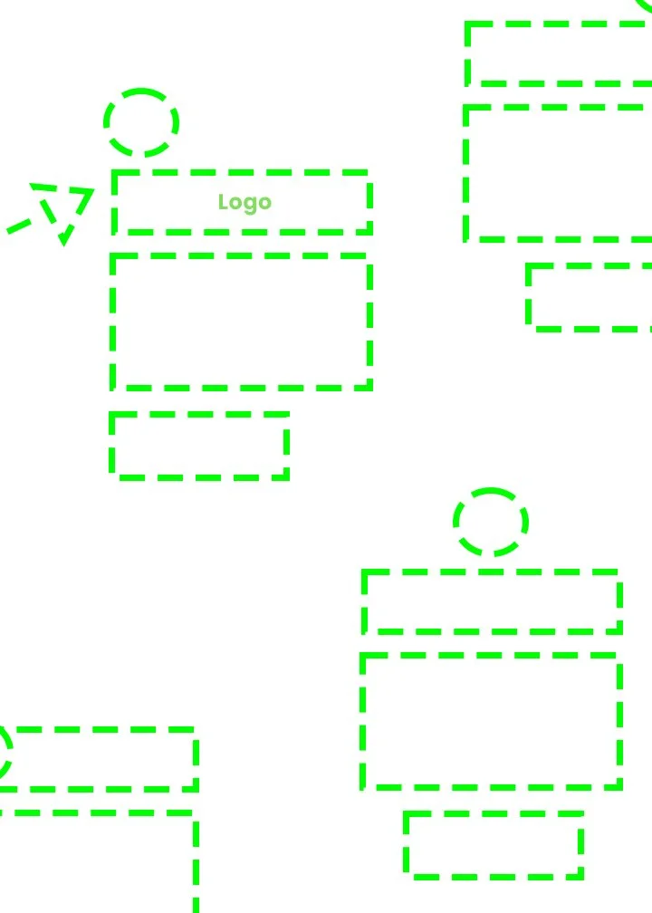
I treated the Logo Block as a simple building block in the design system—kind of like a Lego piece that could work on its own or fit easily with other components.
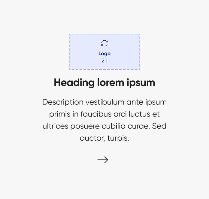
I designed a flexible Logo Block with a consistent 2:1 visual area to support different logo shapes. It includes the logo, title, supporting text, and CTA, with options for left or center alignment.
I explored different variations to see how the component behaved across logo sizes and screen sizes. The layout adapts as needed to keep everything balanced, readable, and easy to scan.
Through feedback and iteration, I refined the component to make it more flexible, consistent, and easy for designers to use.
Defining the Component
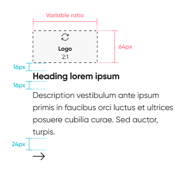
When building the component, I focused on the details that make it easy to use and scale—naming, sizing, spacing, and behavior.
I defined how the logo and content adapt across screen sizes and how the component responds to different interactions. I also aligned labels, icons, and buttons with existing design patterns to keep everything feeling consistent.
By establishing clear rules for size, spacing, and styling, the Logo Block could fit seamlessly into the larger design system and create a more consistent experience across the website.
Design System
Documented usage, spacing, sizing, and variants for designers and developers.
-
The approach streamlines processes, optimizing time and resource utilization for incorporating logos seamlessly.
-
Designed with a consistent 2:1 ratio for each logo, the Logo Block allows easy expansion or adaptation to accommodate growing demands or changes.
-
This approach offers ample room for adjustments and modifications, ensuring adaptability to evolving requirements in logo usage and presentation.
Documenting the Logo Block
I added the Logo Block to our internal documentation site so designers and developers could easily understand, access, and use the component.
The component supports a logo, optional heading, description, and CTA, with left- and center-aligned layouts. I defined five template frames to accommodate different logo shapes and proportions, while keeping the canvas and spacing consistent.
The component also adapts responsively across breakpoints, with the logo, typography, and content adjusting to fit different screen sizes and container widths.
Documenting these rules made the component easier to implement and helped create a more consistent experience across ServiceNow.com.