
Garmin Product Pages
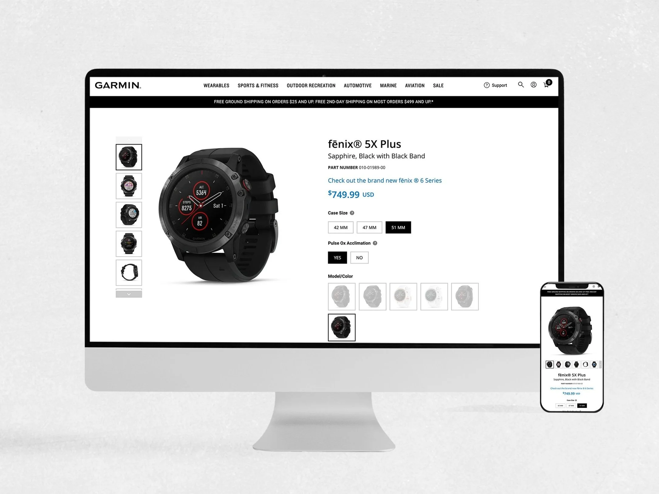
Designing a scalable product experience for 2,000+ products
Redesigning Garmin’s product-page system by understanding what people want, how they think, and what they need next—creating a flexible experience that scales across thousands of products and breakpoints.
Role
Product Designer (Me)
Focus
UX, Responsive Design, Design Systems, AEM, Product Strategy
Scale
2,000+ product pages
Designing the System
Building the System
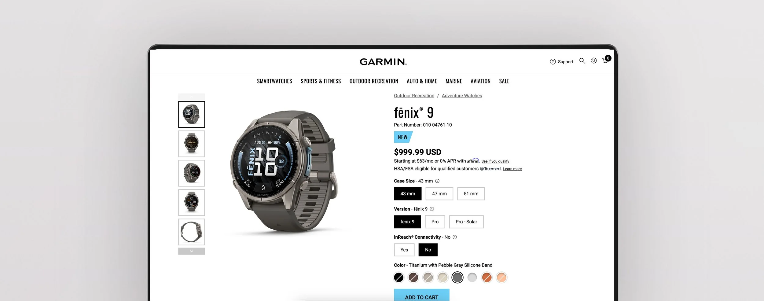
The Fēnix 5 became the starting point for a larger product-page system. We created flexible patterns for content, imagery, navigation, and storytelling that could scale across Garmin’s products.
The challenge was finding the balance between consistency and flexibility—giving teams a shared foundation while letting each product tell its own story.
A big part of my role was collaboration: listening to different teams, understanding their needs, and bringing those perspectives together to create something simple, useful, and scalable.
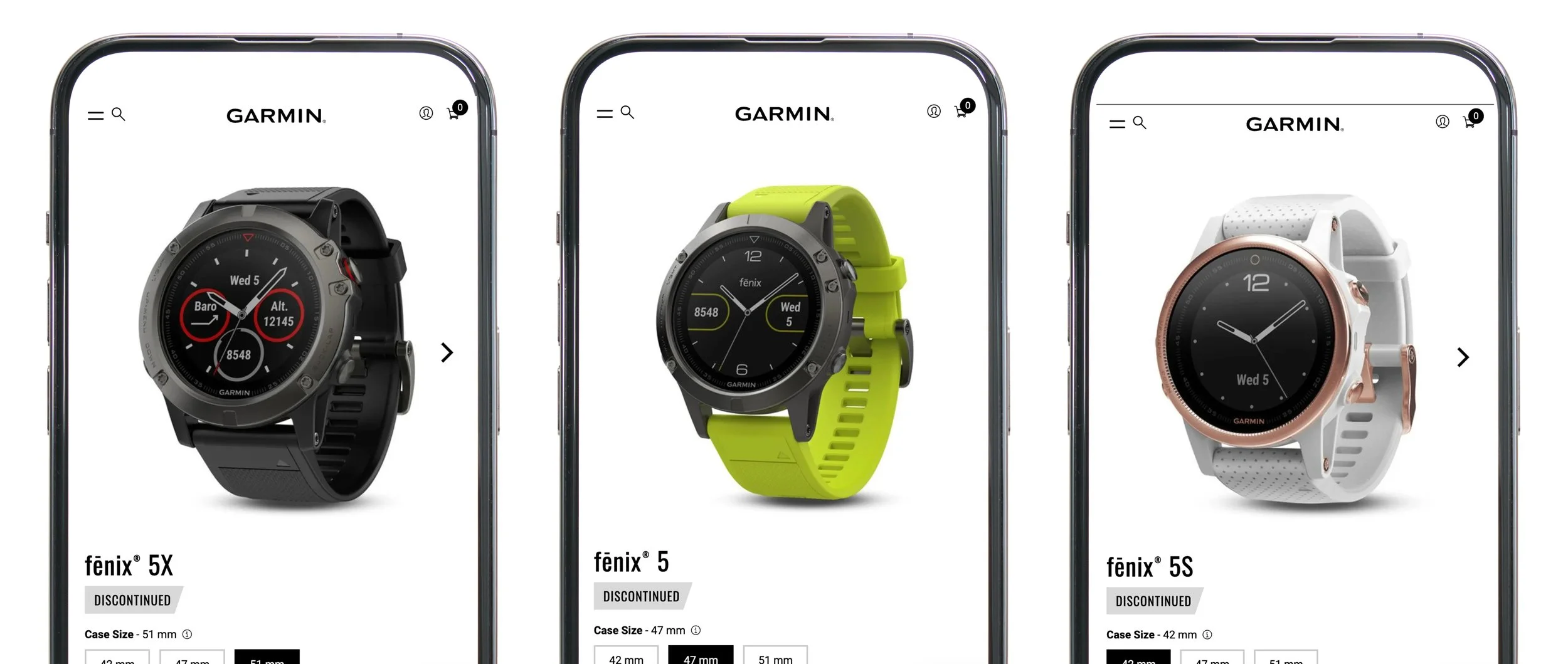
The Story Starts With the User
At every section, we asked, “What does the user want next?”
We wanted to create enough curiosity and desire for people to click, explore, and learn more—helping them see how the product could help them achieve their goals.
I also think it’s important to step outside of your own point of view. Listening to how others see the experience often reveals something you might have missed and ultimately leads to better work.
What I owned
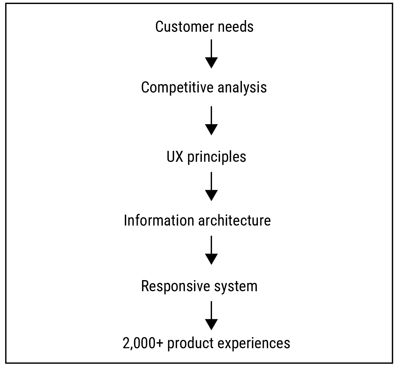
Product-page UX strategy
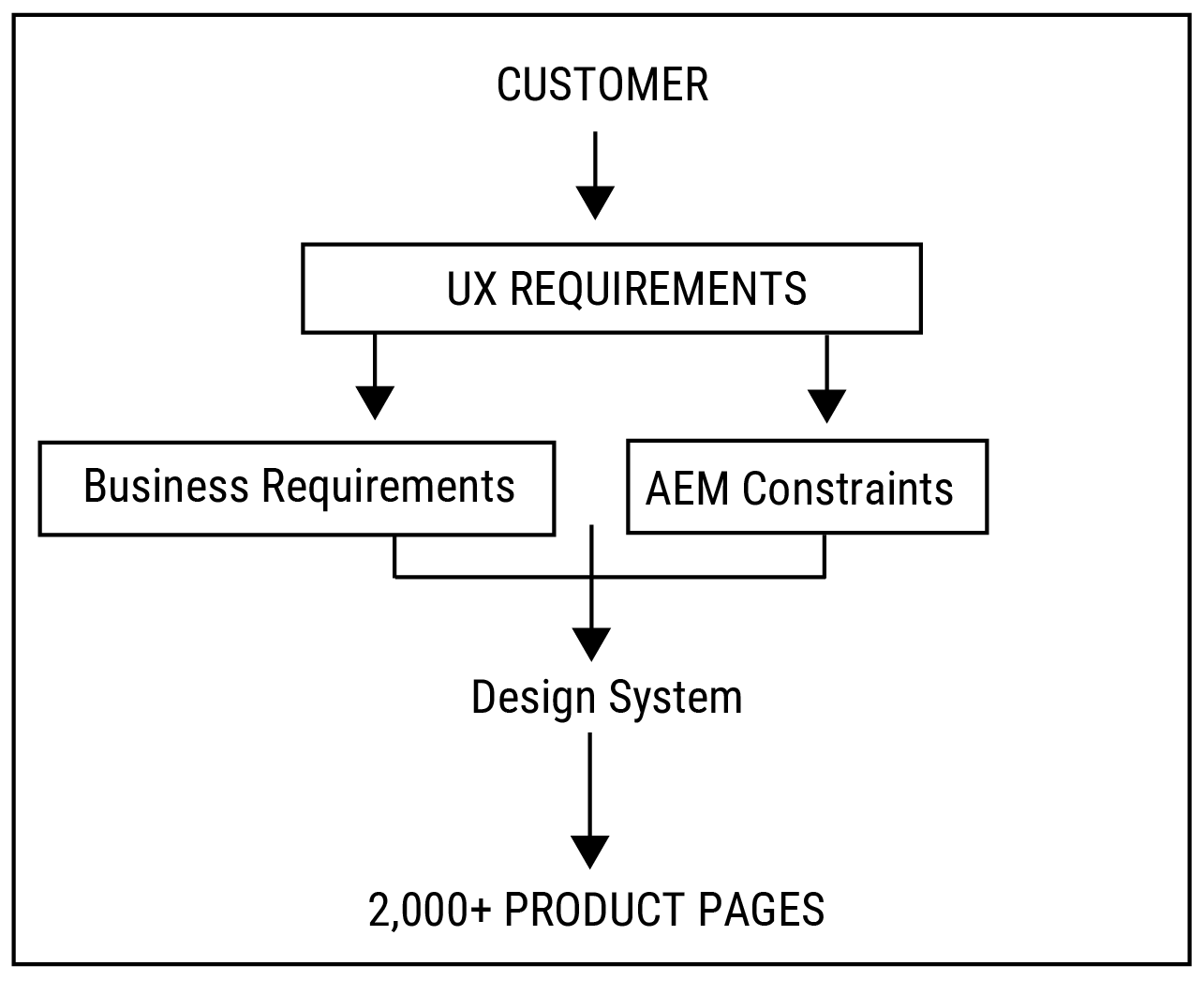
Defined the UX strategy for a scalable product-page system by identifying customer needs, business requirements, and content priorities. These principles shaped the information architecture, responsive behavior, and reusable patterns across 2,000+ product pages.
Responsive layout
During the initial phases of the design process, I created hand-drawn sketches of the user interface to explore ideas, concepts, and identify potential usability issues. These sketches evolved into low-fidelity wireframes and eventually high-fidelity prototypes.
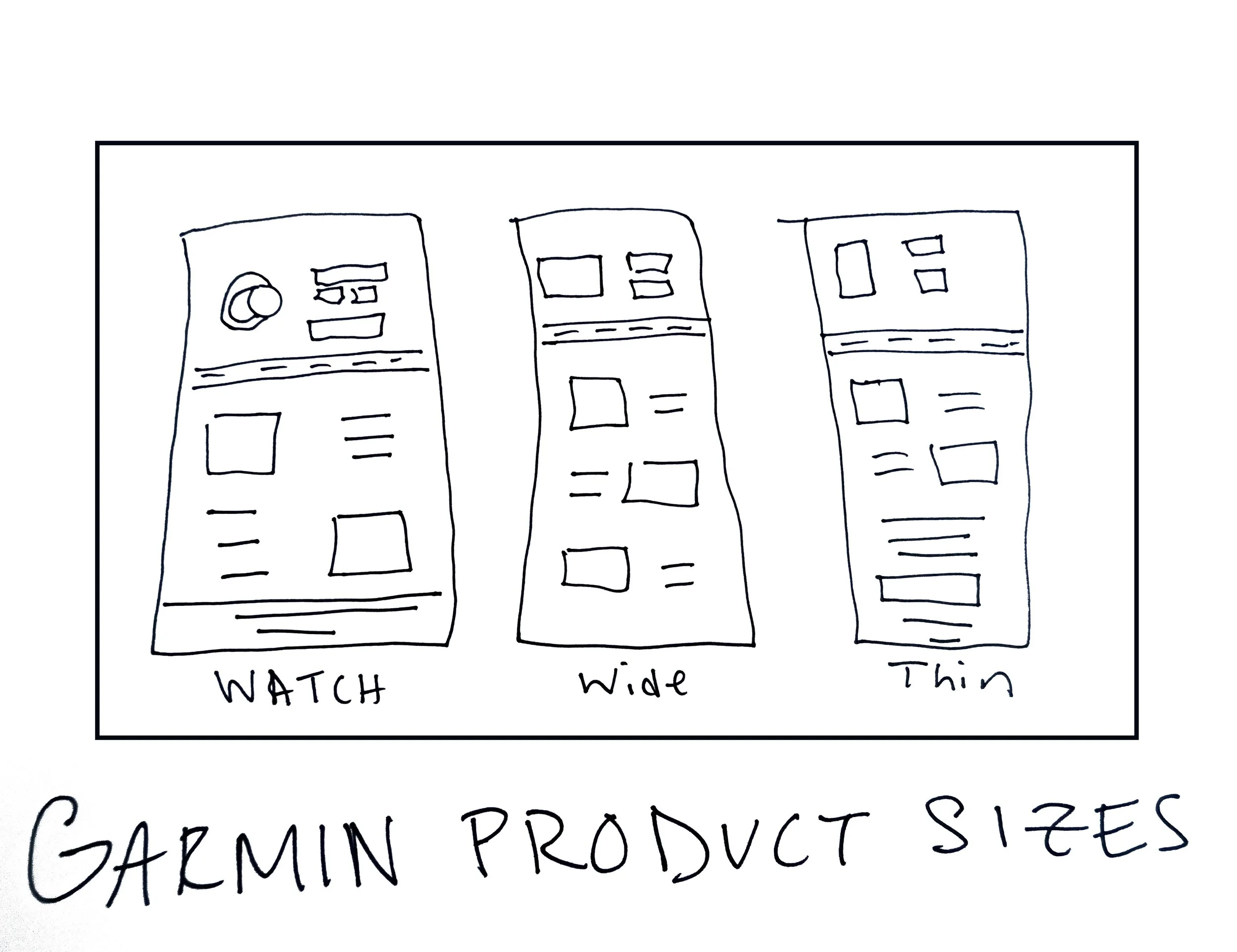
Information hierarchy
I developed both low-resolution and high-resolution wireframes, storyboards, mockups, and high-fidelity prototypes. Continuously gathering feedback from stakeholders, I iterated on designs, identifying and refining any issues along the way. Once we reached a satisfactory stage with high-resolution prototypes, approved by the business, the design was prepared for handoff to the development team.
Building for AEM
The redesign had to work within AEM's content structure, allowing teams to create and maintain thousands of product pages without sacrificing the intended experience.
Creating an Experience Users Want to Explore
For me, great UX comes from great collaboration. Working across many teams, I focused on creating an environment where people felt heard, supported, and comfortable sharing ideas.
I believe appreciation helps teams do better work. I’m generous with praise when something works, and when it doesn’t, I try to stay calm and focus on improving the idea together.
That approach helped us build a strong product experience—balancing impactful imagery, simple UI, and clear content while bringing different perspectives together.
Designing for Both Rational and Emotional Value
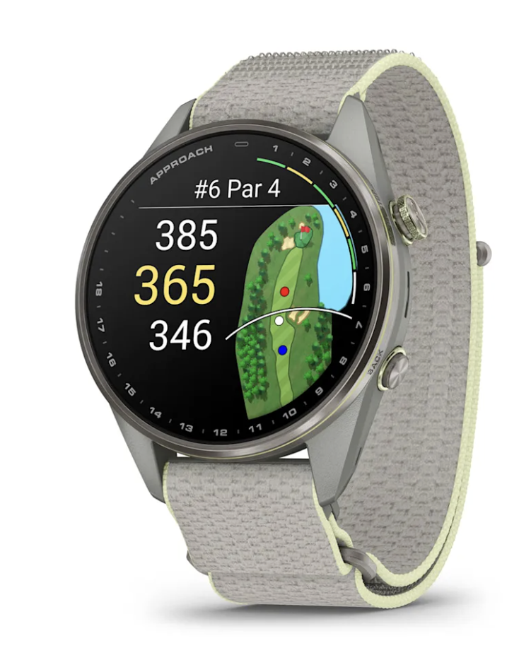
One of the key insights was that users aren't buying a Garmin watch solely because of its specifications. They are buying what the product enables them to become.
The watch represents achievement, confidence, exploration, performance, and personal progress.
That insight influenced the entire experience—from the visual scale of the product to the pacing of content and the way features were presented. We wanted the interface to communicate technical credibility while creating an emotional connection with the product.
What I Learned
Designing at this scale changed how I think about product design. The goal wasn't to create the perfect page—it was to create a flexible system that could consistently produce great pages across thousands of products.