Transforming the Approach to Crafting Digital Design Systems

The Team
2 Design System Designers
1 Copywriter
1 Front-end Scrum Team
1 Product Manager
Scrum Master
Lead Systems Designer
The Role
I was assigned, along with another designer, to review and update the digital design system. Our responsibilities included developing components and different alignments and variations, iterating user tests on the components to ensure flexibility and scalability, addressing feedback, documenting the functionality of components within the design system, and working closely with product manager and front-end engineers to implement the design.
Timeline: 7 Months
Overview
Founded in 2003, ServiceNow witnessed rapid growth, prompting the addition of substantial content to the site to cater to users and stakeholders. Despite this swift expansion, there emerged a need for a well-structured foundation on the website. This foundation was designed to function as a central resource hub for designers, developers, and product managers, providing valuable information about the innovative digital design library.
The primary objective of this library was to house diverse components, facilitating seamless collaboration between designers and developers while eliminating silos in the process. A dedicated digital design team has meticulously crafted a comprehensive design system and component library. This system is employed by multiple teams, each focused on specific interconnected digital products. For each product, one or two designers are specifically assigned, ensuring dedicated attention to its development.
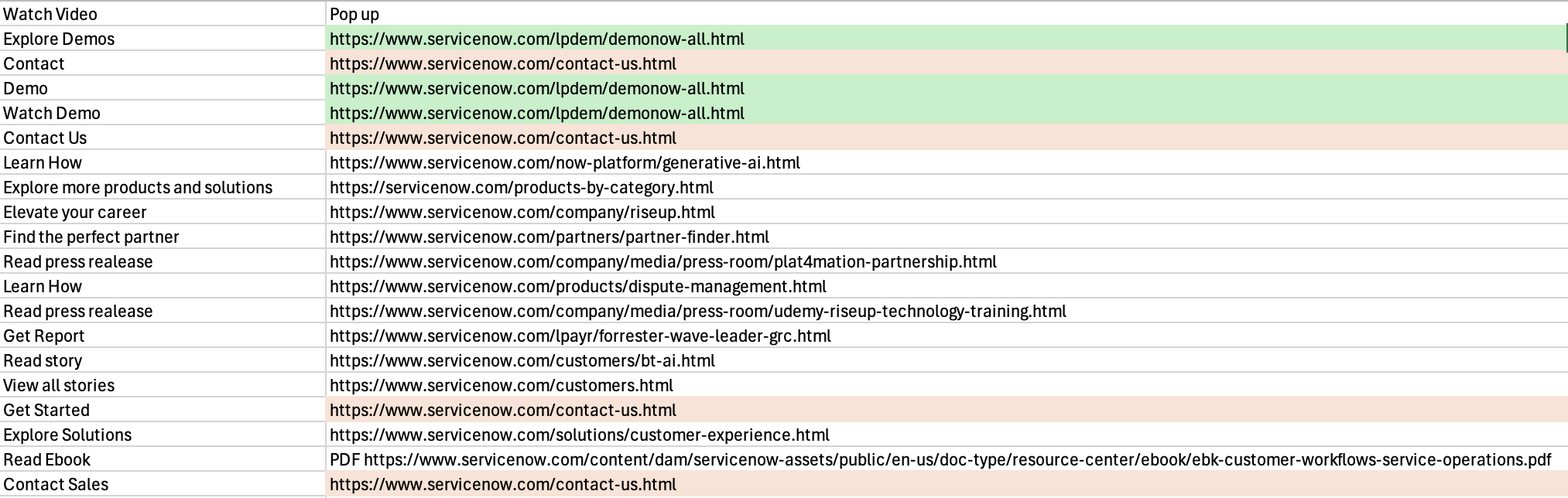
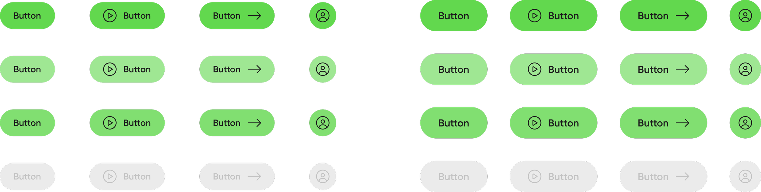
Homepage Buttons
Identifying User Requirements and Deficiencies
I identified an issue while observing user interactions on the website, which led me to recognize certain patterns in user behavior. Through comprehensive analytics, it became apparent that specific sections of the pages were receiving considerably more traffic than others. For example, the home page attracted an average of 5,000 visits per day, while certain button clicks on the page received fewer than 500 visits during the same period. Additionally, it became evident that the website was inundating users with an excessive array of options, resulting in information overload.
Consequently, I undertook a detailed analysis to pinpoint areas of inefficiency and redundancy within the website's design. This involved scrutinizing the various components and links present on the pages, noting similarities in content and functionality across different sections. For example, I observed that there were three separate links leading to the “Demo” and “Explore Demos”, each presented in slightly different formats.
Armed with these insights, I proactively compiled a comprehensive report outlining my findings and recommendations for improvement. Central to my proposal was the simplification of the user experience, achieved through the consolidation of smaller components into larger, more coherent units, each offering a broader range of options. For instance, I suggested merging the "Contact Us" and "Get Started" sections into a single, easily accessible entity, thereby reducing user confusion and facilitating smoother homepage experience.
Upon presenting my findings to the team, I advocated for a streamlined approach to enhance user navigation and reduce cognitive load. Subsequent discussions and iterations focused on refining the proposed solutions, ensuring they aligned closely with our overarching objectives. We simulated user testing scenarios using mock data to gauge the effectiveness of the proposed changes and iterated accordingly.
Continuing my efforts, I persisted in identifying further areas for enhancement, presenting my discoveries to the team for collaborative refinement and implementation. Through a process of ongoing evaluation and iteration, we collectively worked towards optimizing the website's usability and overall user experience, ultimately leading to a noticeable improvement in user engagement and satisfaction metrics.
Business Problem to Solve
We found issues of irregularities and disorganization surfaced during our assessment. Designers were consistently developing similar components independently or addressing similar UI challenges already encountered in other products. Collaboration between designers was hindered by the need to cross-verify existing patterns, compounded by Figma files being linked to numerous libraries. This not only disrupted the workflows of both designers and developers but also posed a potential risk of creating inconsistencies in brand and user experience across digital products. The challenge at hand is finding ways to enhance design processes and establish a uniform, scalable experience across a diverse portfolio of products within the large corporation.
Goal
Our plan was to facilitate the product development workflow, create a consistent visual identity for a varied array of software solutions, and equip our product teams for future scalability. In constructing our component library, we prioritized our internal designers product managers and front-end engineers as the primary users. The selection of design system elements aligned with ServiceNow’s product strategies, and we transformed them into flexible Figma components suitable for constructing diverse workflows. Collaboration with developers was integral to ensure that the Storybook component library accurately mirrored the interactive patterns we developed in Figma throughout our design process.
Building the Essentials
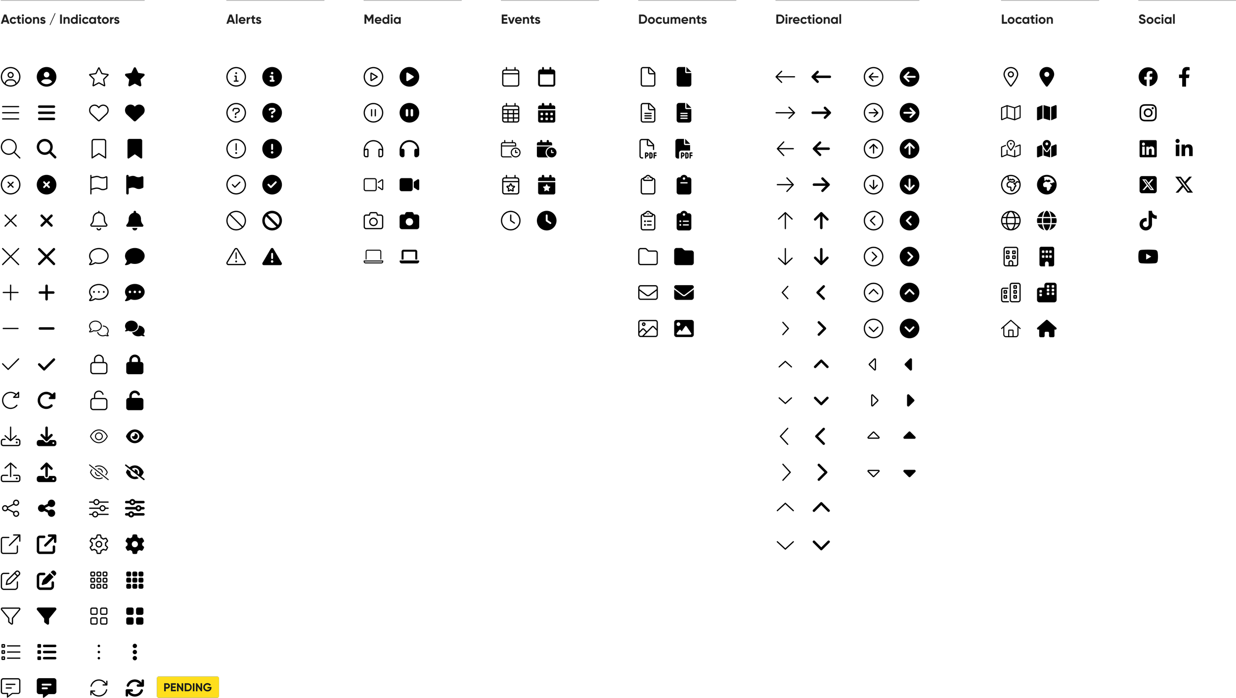
Our emphasis was on constructing fundamental components crucial for diverse workflows, including buttons, text links, form inputs, cards, tables, and accordions. Each component is meticulously crafted with a distinct name, breakpoints, size indications, and interactive state changes such as default, hover, focus, error, and disabled. Integration of labels and icons is implemented where applicable. These components act as the foundational elements, establishing a baseline that allows grouping and repurposing to fashion larger components tailored for a multitude of use cases.
Design principles
Establishing the groundwork for our design choices involved aligning each Figma element we created with a set of guiding principles. These principles served as a reference point for our design team:
Efficient Development Workflow: The streamlined design-to-development process significantly improved the efficiency of teams. Designers could easily access and implement standardized components, reducing development time and minimizing the risk of inconsistencies.
Consistency Across Products: The implementation of the ServiceNow Digital Design System resulted in a harmonized visual identity across all products. Consistent design elements, color schemes, and typography enhanced brand recognition and instilled a sense of cohesiveness.
Scalability for Future Growth: The modular and adaptable nature of the design system allowed ServiceNow to effortlessly integrate new features and products. The design system proved its scalability, ensuring that ServiceNow's digital presence remains flexible in the face of evolving industry trends.
Foundation
Establishing the base with color, typography and spacing
While recognizing that refinements would occur in subsequent iterations, our initial focus was on solidifying a color palette, typography, spacing and guidelines before delving into other components. To ensure the adaptability of our design system, we opted for a color palette with inherent contrast and a legible typography scale.
Color


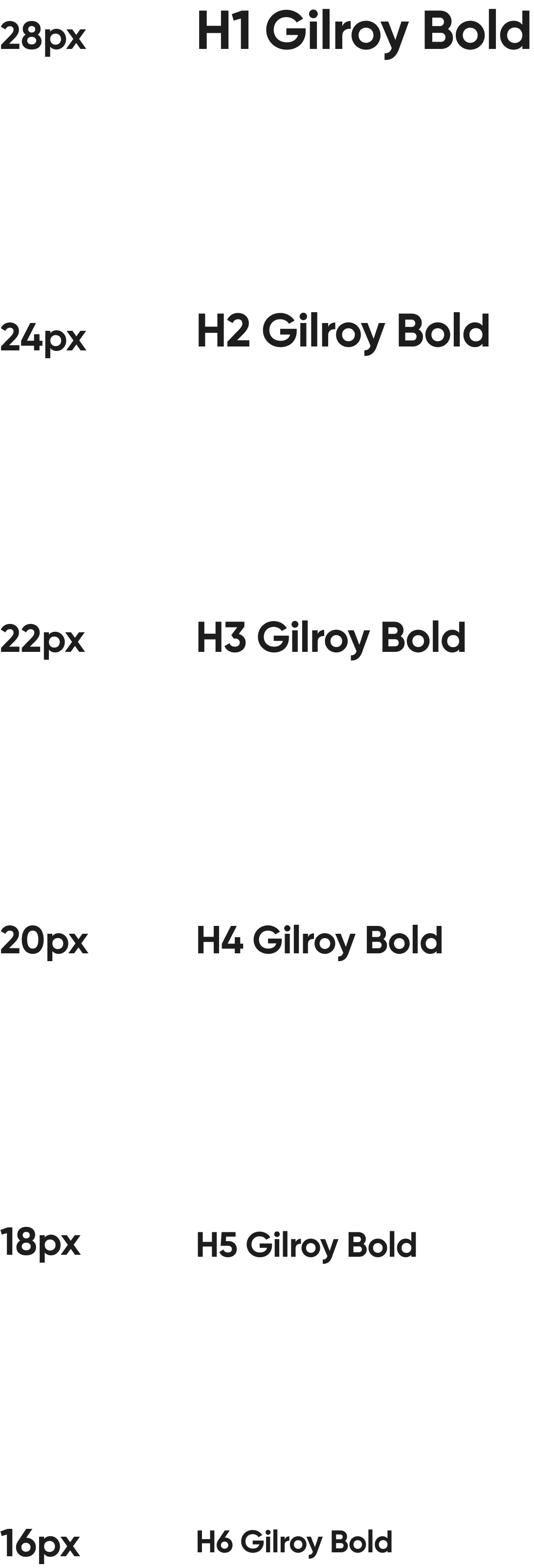
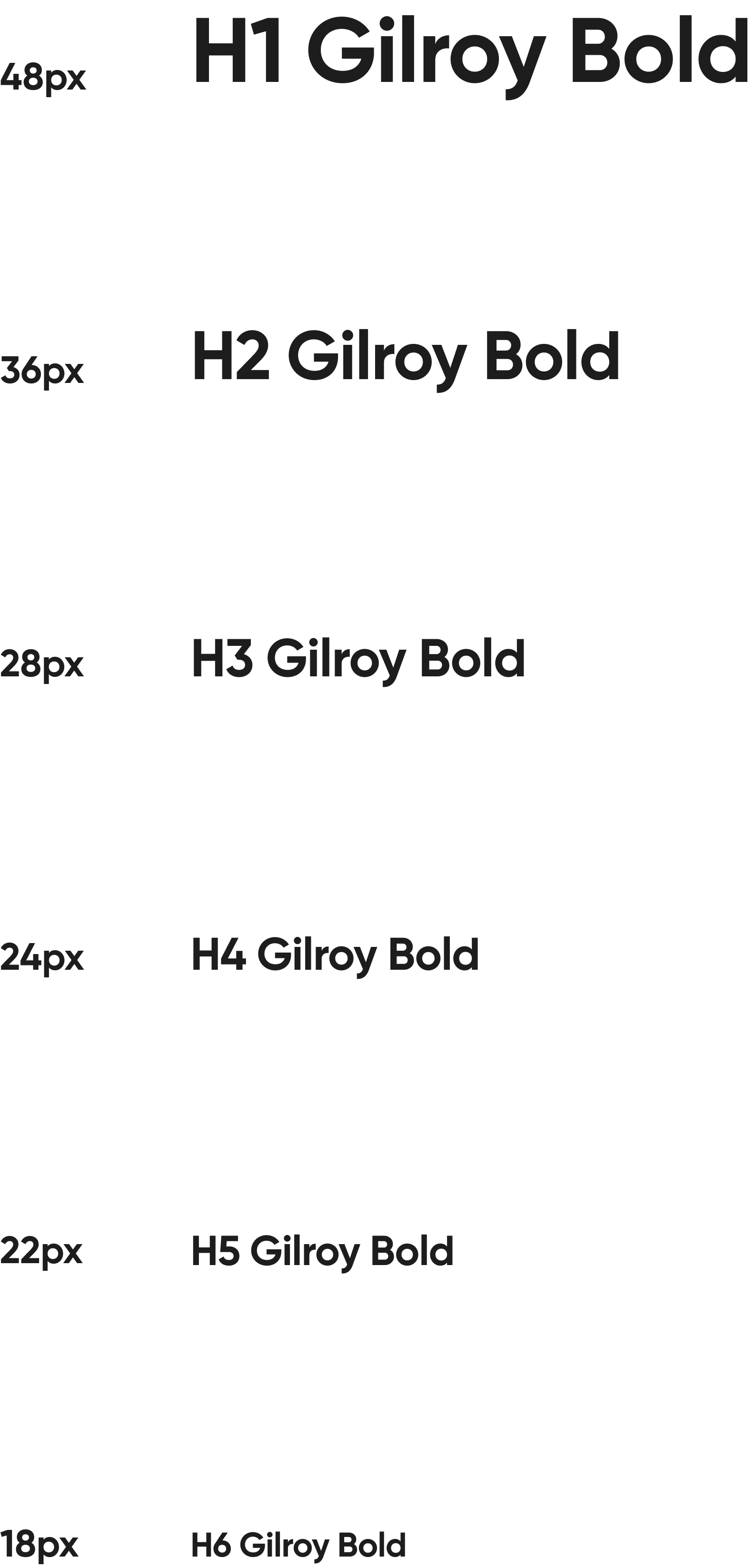
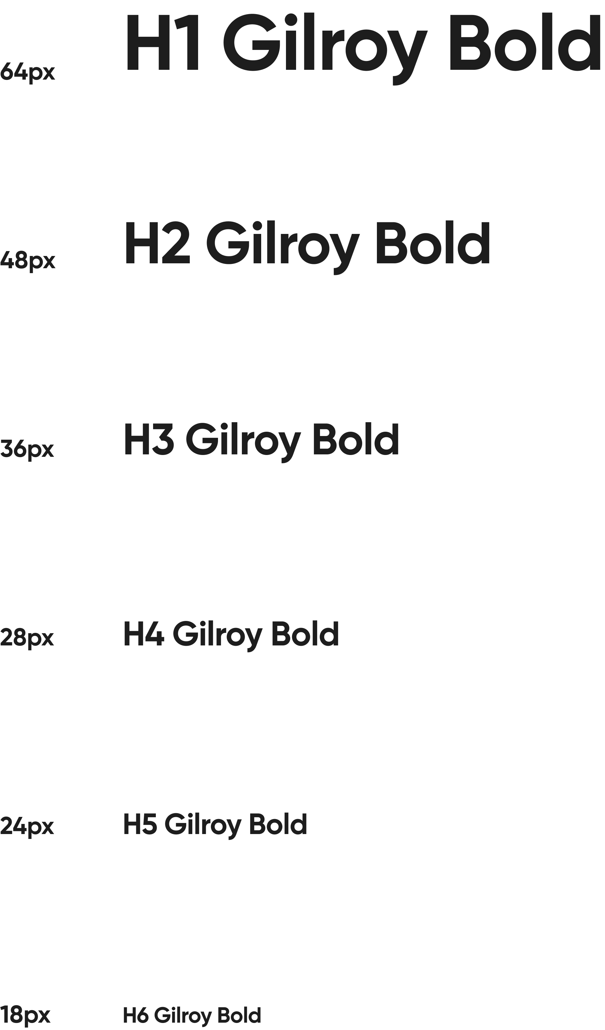
Typography

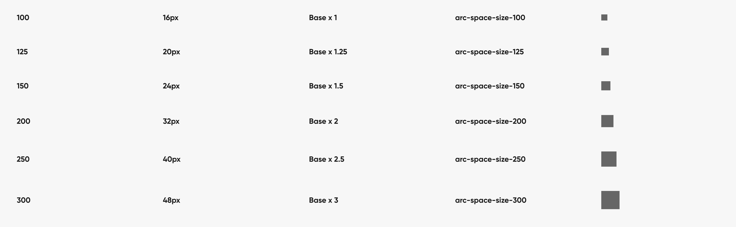
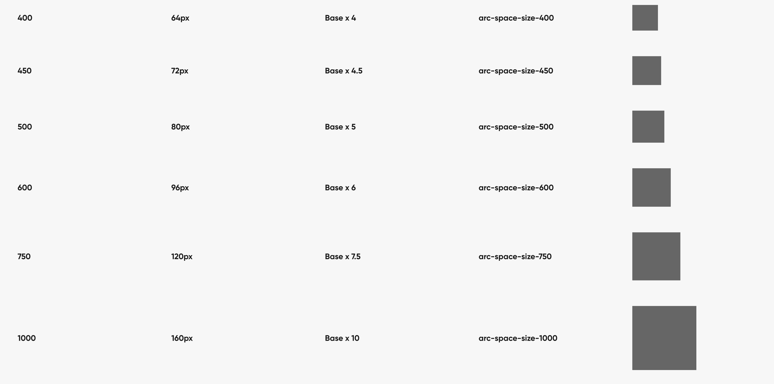
Spacing
Guidelines
When we create each part, we pay close attention to its name, where it changes, and how big it is. This helps it do different things when you use it, like when you click on it or if there's an error. We also add labels and iconography to make sure everything fits together and makes sense. It's important that all the buttons and little pictures look the same across the whole website so it looks neat and organized. We decide on standard sizes, shapes, and styles to make everything look like it belongs together.
Buttons
Iconography
Components
In ServiceNow's Digital Design System, components play a pivotal role in shaping a cohesive and user-friendly interface across a diverse range of products and services. These components, ranging from buttons and forms to complex interactive elements, are meticulously crafted with attention to detail, ensuring a consistent visual language and seamless user experience. Each component is designed to be modular and reusable, providing a flexible foundation that accelerates development while maintaining design integrity.
Iterative process
ServiceNow's Digital Design System components evolved through iterative processes, aligning with user preferences and industry standards. The resulting comprehensive library enhances team efficiency, scalability, and adaptability for sustained growth and innovation. Simultaneously creating a Figma component library during the design system's development revealed unforeseen gaps, requiring solutions to balance system thinking complexities and accommodate Figma users without compromising effectiveness.
Crafting the logo block: A key component
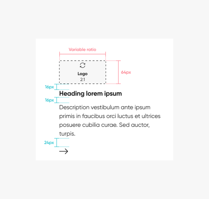
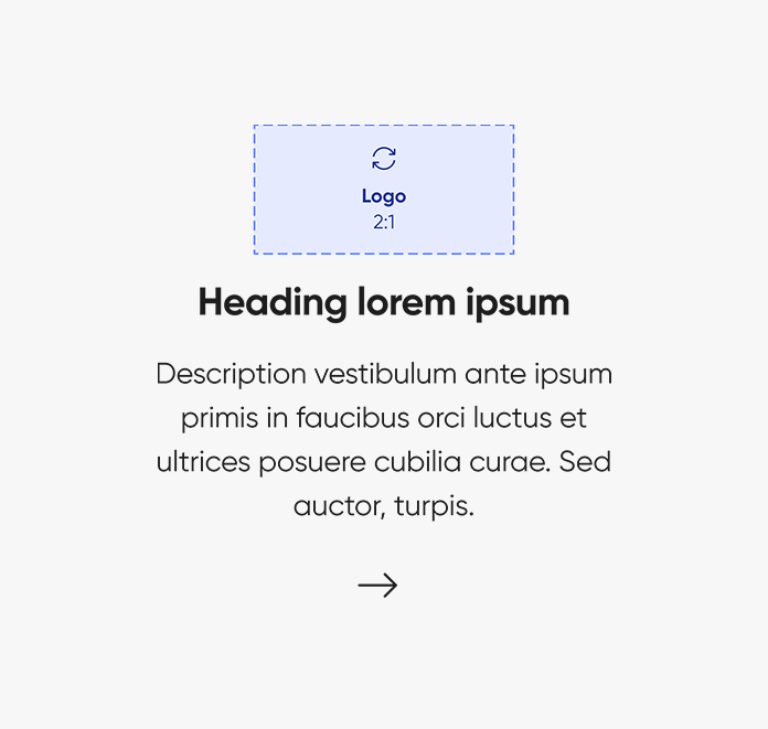
Think of the "Logo Block" as a basic building block in our design system, like a Lego piece that can show a logo along with some text. It can be used by itself or put together with other pieces to create more complex designs. This block includes an image, a title, some text, and a button to take action. We have different versions of this block, each adjusting to the size of the logo. The block is set to be a certain height, and it changes its width to match. It has a light color scheme, and you can choose to align it to the left or center. The cool part is that as you work on different devices or screen sizes, the text and logo adjust to look just right.
Initial design of logo block
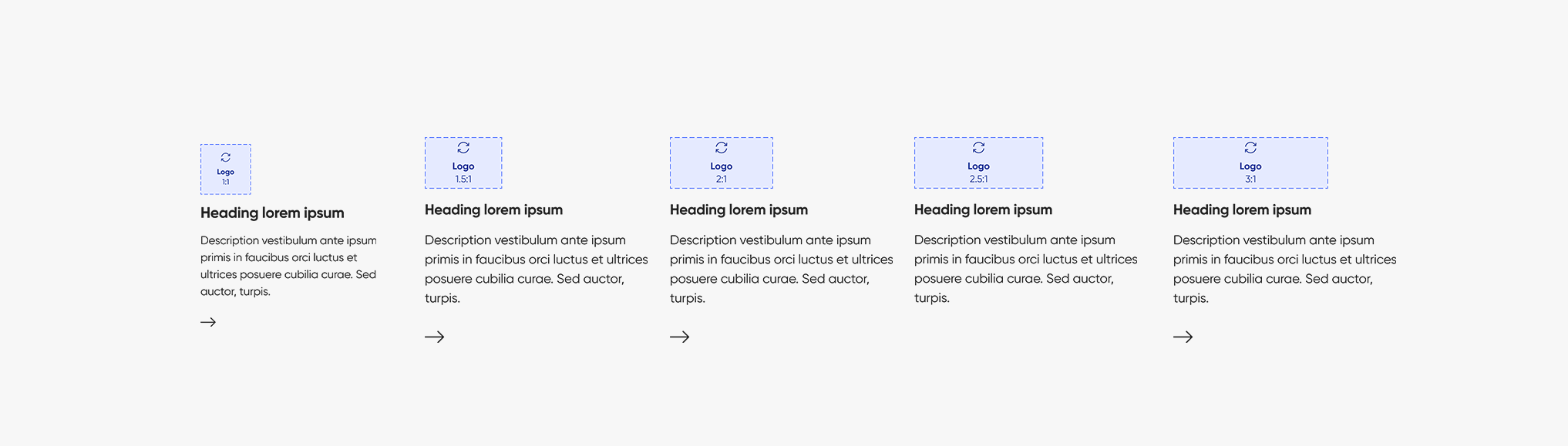
In the initial stages, we aimed to allow logos to fit within a 2:1 ratio for all types in the Logo Block component. The primary objective was to simplify the process for designers to seamlessly integrate logos from the library into various project elements. However, a challenge emerged as logos were displaying in different sizes, prompting the need for resolution.
Advantages of the current logo block approach
Efficiency: The approach streamlines processes, optimizing time and resource utilization for incorporating logos seamlessly.
Scalability: Designed with a consistent 2:1 ratio for each logo, the Logo Block allows easy expansion or adaptation to accommodate growing demands or changes.
Flexibility: This approach offers ample room for adjustments and modifications, ensuring adaptability to evolving requirements in logo usage and presentation.
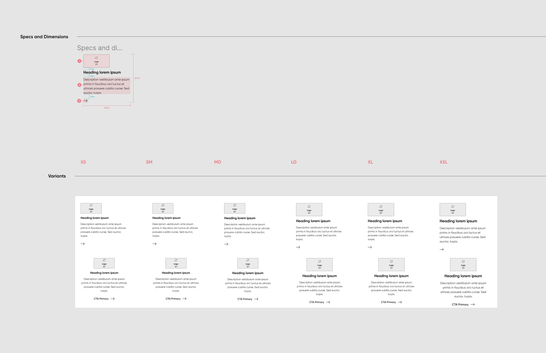
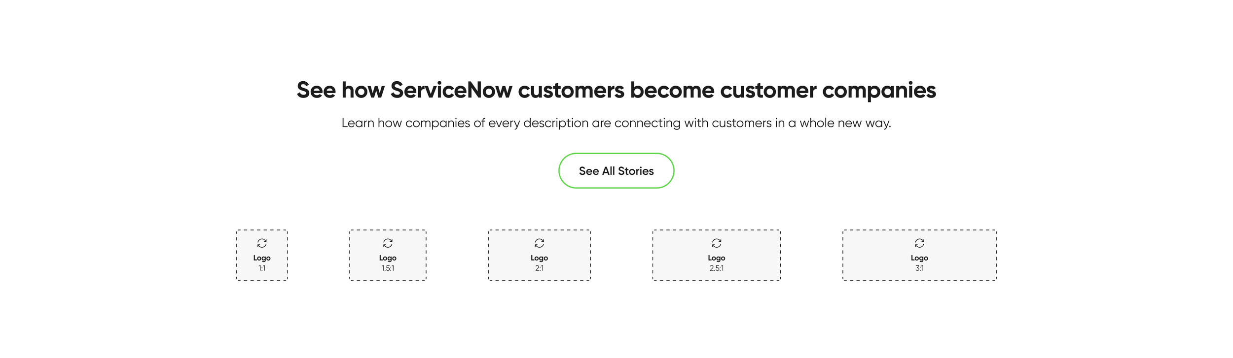
Unified design for logo block
We tested lots of different-sized logos and figured out a solution. Now, we have five versions of each logo, each designed to fit its size just right. Even though they have different shapes, we made sure they all look the same size when we put them into the code. This way, no logo looks bigger or smaller than the others – they all fit together nicely!
Advantages of the approach
Uniformity: Ensures a consistent and cohesive appearance of logos across different sizes.
Versatility: Provides flexibility with five logo variations, accommodating diverse logo sizes and shapes.
Adaptability: Tailors each logo to different ratios while maintaining a standardized 240px for seamless integration.
Prevention of Discrepancies: Mitigates the risk of logos appearing disproportionately in the code, fostering a balanced visual presentation.
Efficiency: Streamlines the process of logo integration, saving time and resources for a smoother design implementation.
Documentation
Guidelines for UI delivery
Anatomy: Details on each component, encompassing labels, icons, and padding.
Interactive patterns: Descriptions of states and use cases.
Colors: Prescribed colors for each component.
Figma guidance: For designers, enhancing their utilization of the library.
Logo block documentation
I added logo block to our internal documentation site for other designers and developers to view.
You can use the logo block component to display a logo and description. It can only be nested inside more complex components, such as carousel. The logo block includes a logo with optional heading description and call to action (CTA). The logo block canvas height is set at 240px, with the width scaled proportionally. There are five template frames available based on the width and height of the logo. The text wraps responsively to the width of its parent container. There are two options for alignment shown above, left and center aligned. For each breakpoint, the heading and description font sizes, along with the logo, adapt dynamically at every breakpoint to suit various layout widths and screen dimensions.
Outcomes and impact
Organizing and documenting components is like assembling digital building blocks within the dynamic design system—a living repository for diverse components shaping digital experiences. Navigating this process feels like solving a puzzle, a challenge embraced. Iterative design, fueled by ongoing feedback, revealed the importance of templates, especially for flexible components. In its initial iteration for Servicenow, the design system is set for expansion, proving crucial for onboarding new designers and streamlining workflows.