
ServiceNow Arc Design System
I audited zeroheight documentation, organized component information, and documented 20+ components.
Role: UI/UX Designer
Focus: Design Systems, Component Library, UI Design, Responsive Design
Deliverable: Reusable Logo Block Component and Documentation
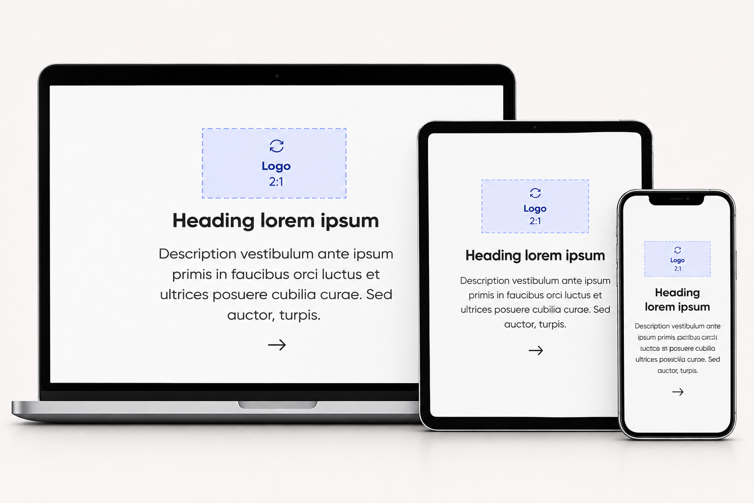
ServiceNow ContextServiceNow serves very different users, from IT teams and employees to developers, admins, and customers. A design system keeps the experience consistent for all of them, and small components like the Logo Block, are where that consistency is won or lost.
Developed and maintained 20+ reusable UI components, including quote block, filter block, carousel block, and marquee block.
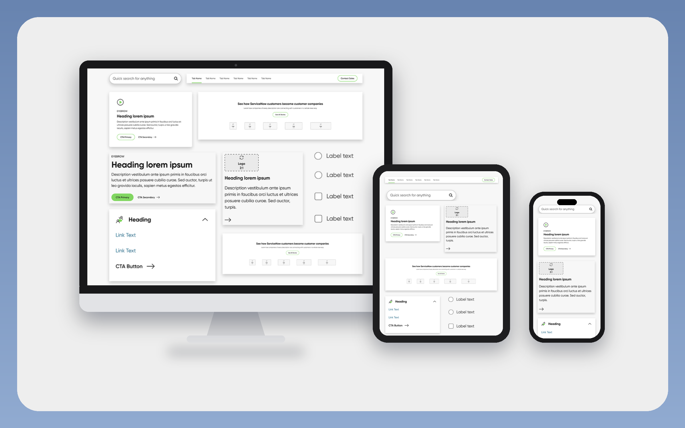
My focus was on Logo Block
Logos came in many proportions, so some looked tiny and others huge, and designers resized them by hand.
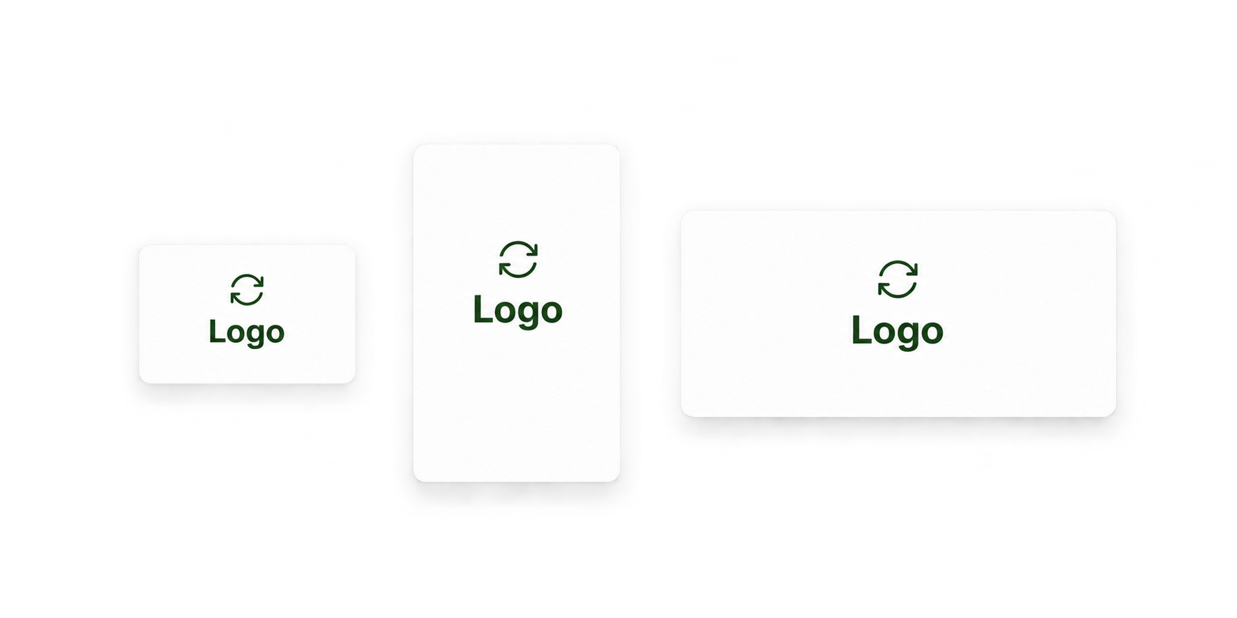
The Logo Block needed to support different logo proportions and layout configurations while maintaining consistent sizing and spacing across the ServiceNow Arc design system.
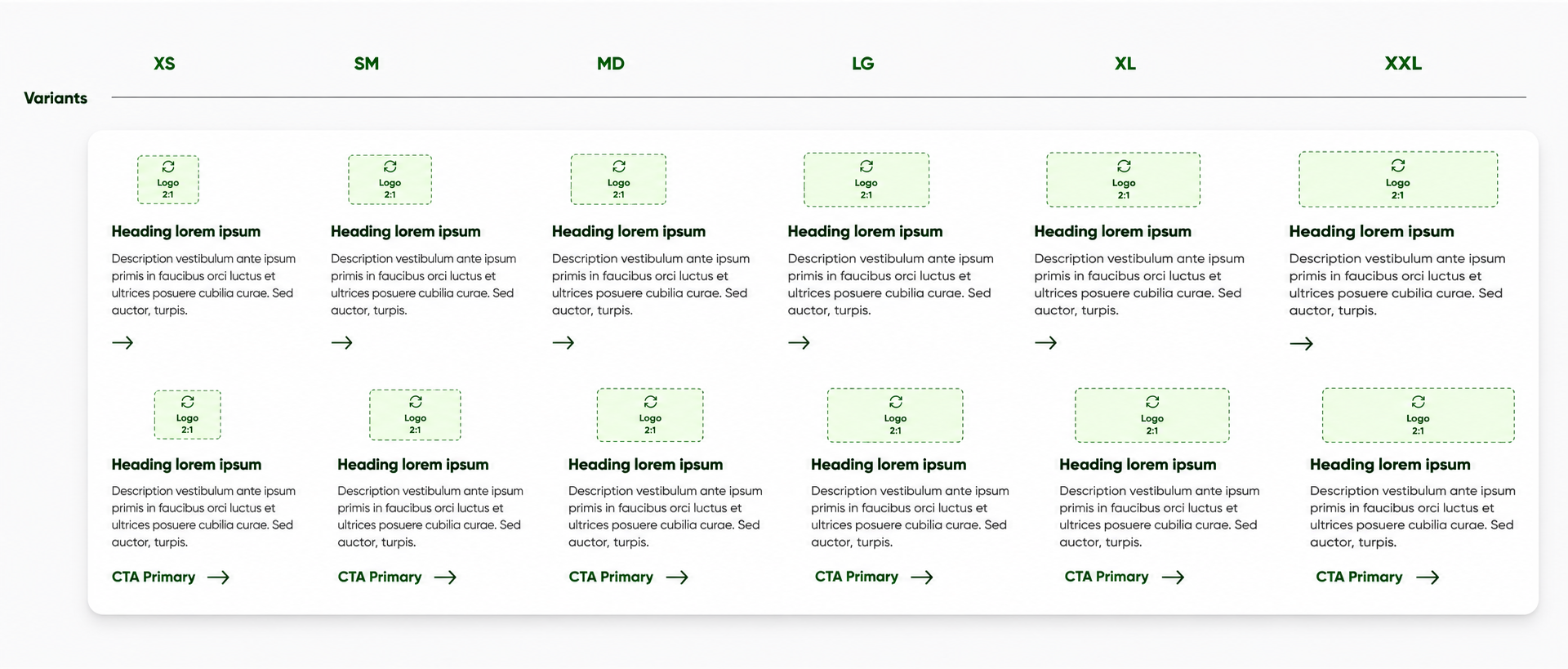
Logo proportions: Support 1:1, 1.5:1, 2:1 (default), 2.5:1, and 3:1 aspect ratios.
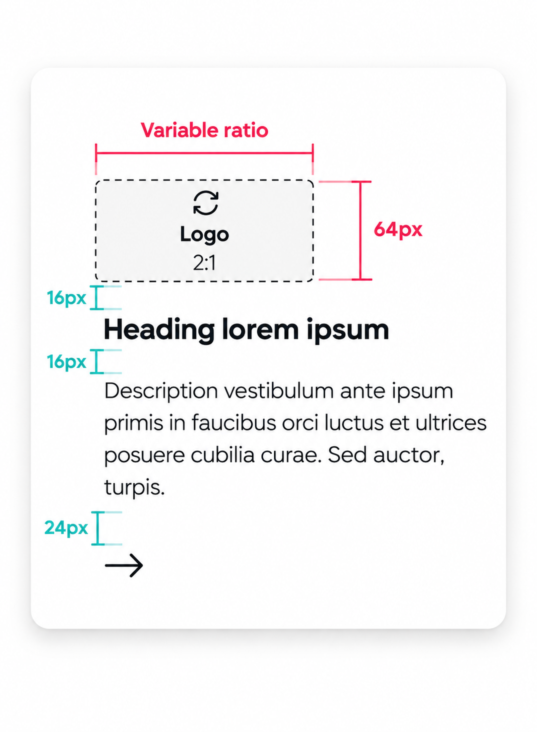
Logo sizing: Define consistent image widths of 64px for XS–MD and 80px for LG–XXL.
Alignment: Support left-aligned default and center-aligned secondary layouts.
Content flexibility: Allow optional headings and CTA buttons.
Responsive behavior: Maintain consistent spacing and alignment across screen sizes.
Reusable specifications: Establish clear rules for component properties and variants to support consistent design and development handoff.
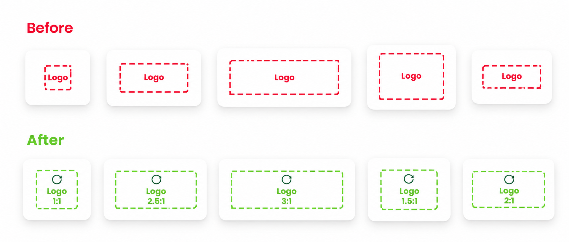
Logo Block Requirements
We chose 5 Ratios
Why five ratios?
Logos come in many shapes, so I created five ratio frames (1:1, 1.5:1, 2:1, 2.5:1, and 3:1). Together they fit the height and width requirements, so any logo can sit in the component without being stretched or cropped.
Why 2:1 as the default?
More of the logos we needed to display were 2:1 than any other size, so making it the default means most teams can use the component without changing anything.
Why 64px and 80px?
Logos are 64px wide for XS to MD and 80px wide for LG to XXL. Smaller screens get slightly less padding and larger screens get more, so logos keep the right visual weight at every breakpoint.
Why nestable only inside complex components?
The Logo Block is designed to sit inside larger components, such as a carousel. It pairs a logo with a description and other small elements, so it works best as a building block within a bigger layout rather than on its own.
Documenting the Logo Block
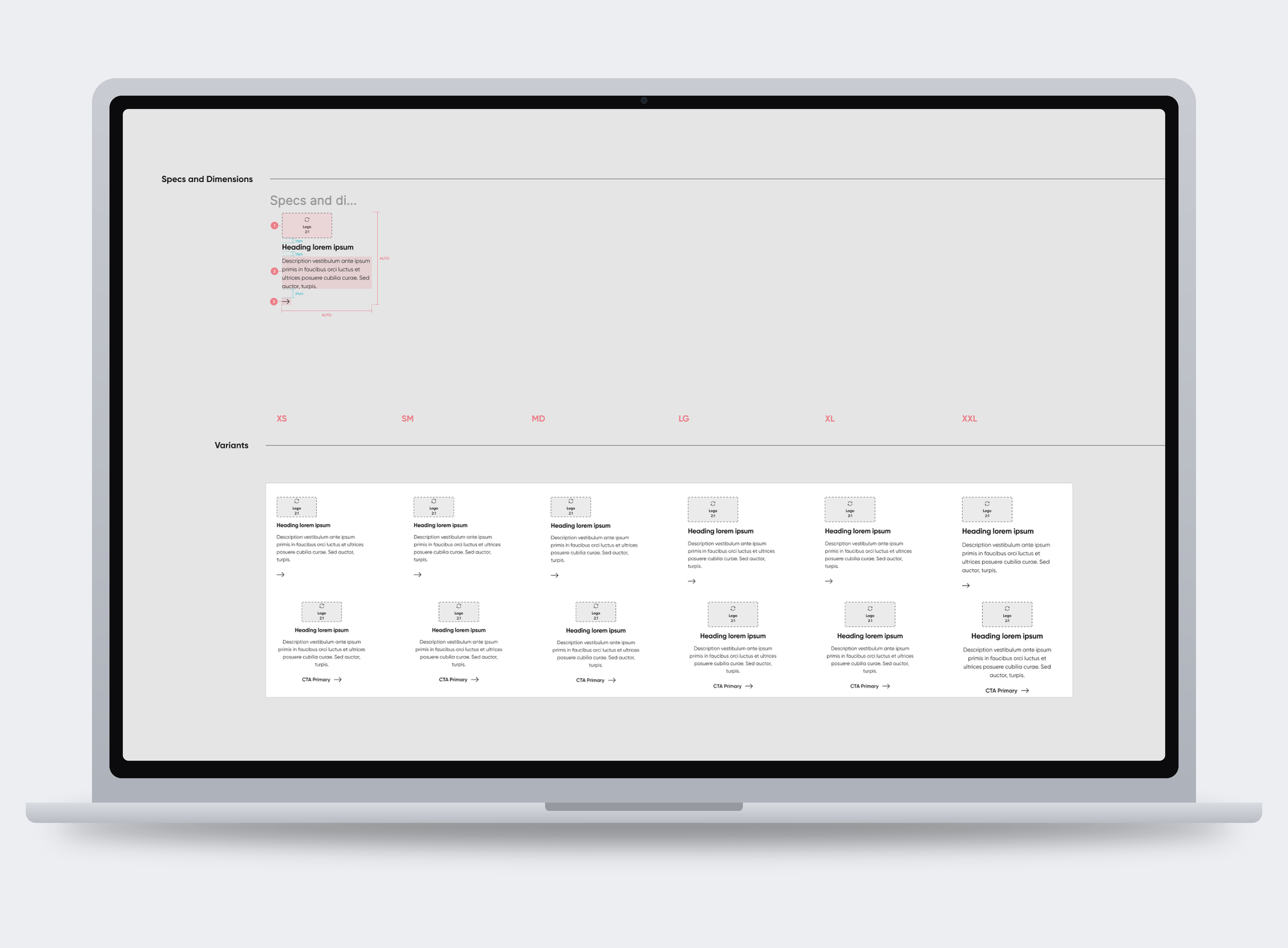
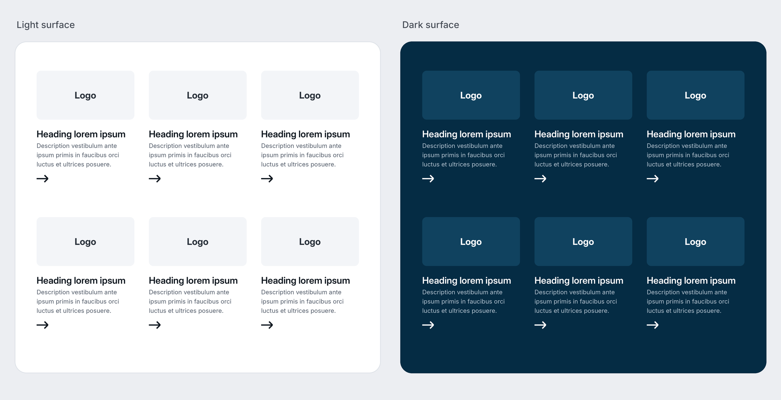
I documented the Logo Block in a Figma library template that lays out every variant across alignments and light and dark surfaces, with an annotations panel explaining each option, then published those rules to our internal documentation site so designers and developers can easily understand, access, and use the component consistently across ServiceNow.com.
Outcome
Adopted by 3 teams, the logo block halved design and dev time by replacing one-off layouts with a single, consistent and responsive component.
Reflection
Working on the Logo Block taught me that flexible components need clear rules more than case-by-case fixes. Next time, I’d test with real partner logos earlier. My next step is to check how the five ratios and the 64px and 80px widths hold up across breakpoints, and to refine the specs for any logos that still look off.