
UI/UX CASE STUDY
Making Therapy More Accessible for Students and Families
Connecting students across 20+ schools with therapy services
Redesigning the HelloHero experience to help students and families find and connect with therapy services through their schools and local communities.
My Role
As the UX/UI designer, I focused on refining HelloHero's existing platform to create a more intuitive and cohesive user experience. My work included improving user flows, exploring UI concepts, and preparing designs for developer handoff.
Scope
Existing Platform Refinement
Tools
Figma, Adobe Creative Suite
Platform
Responsive Web
Team
Product Designer, UX/UI Designer, Developers
We Started Researching
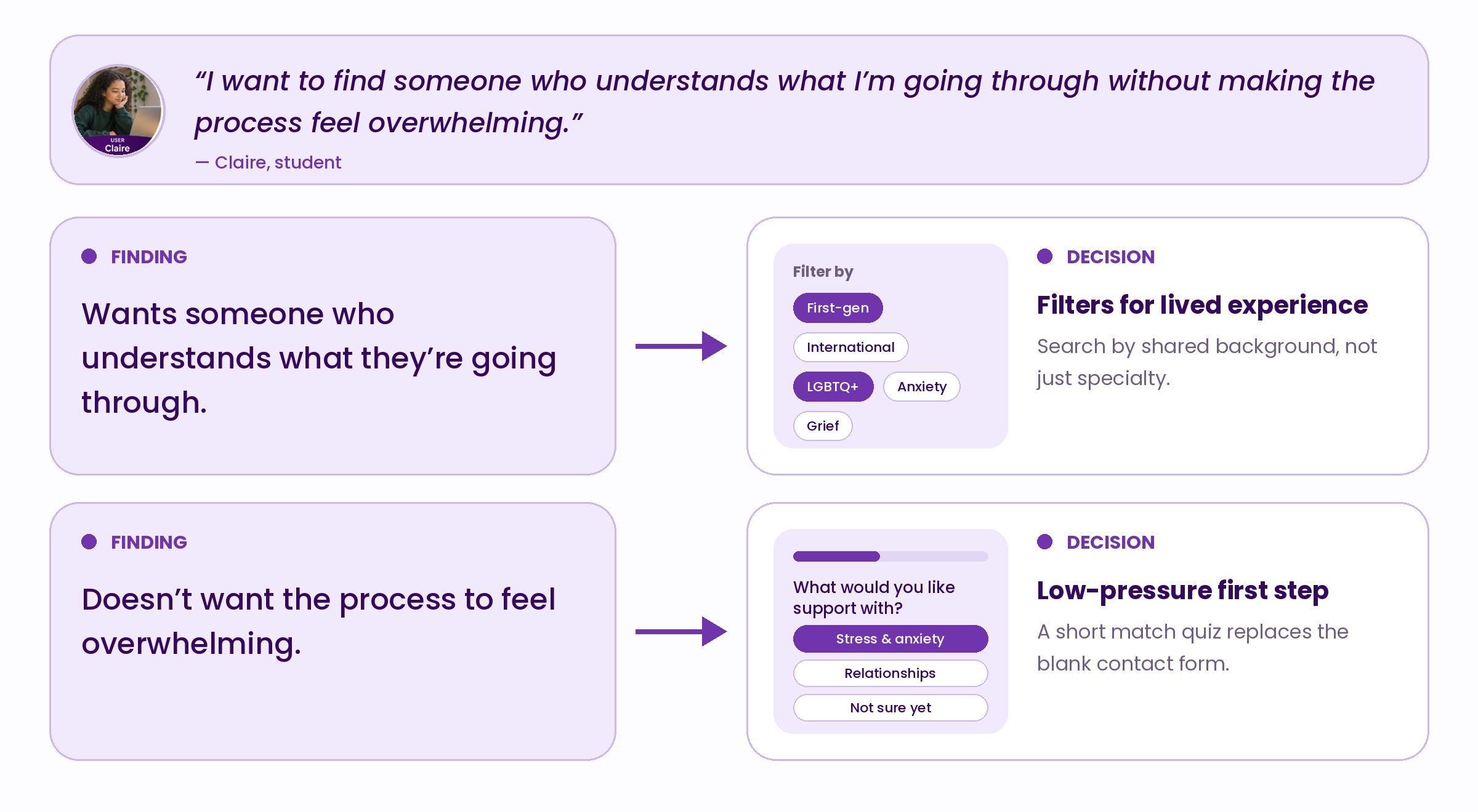
Interviews with students showed that the hardest moment isn’t finding a therapist, it’s making first contact. Participants described anxiety about being misunderstood and uncertainty about whom to trust. In response, HelloHero’s profiles lead with human, plain-language introductions, filters reflect lived experience, and the first step is a low-pressure match quiz rather than a booking form.
The Design Challenge
Finding the right mental health support can be overwhelming, particularly for students and families navigating the process for the first time.
HelloHero needed a clearer, more intuitive experience that helped users understand their options and take the next step toward accessing support. The challenge was designing for multiple audiences—students, parents, therapists, and staff—each with different needs and expectations.
Understanding the Student Claire Smith
The Student Seeking Support
Age: 14
Role: Student
Primary Goal: Find a therapist who understands her needs.
“I want to find someone who understands what I’m going through without making the process feel overwhelming.”
Understanding Student Needs
Through conversations with students, we explored their concerns, expectations, and challenges when seeking therapy. These insights, combined with existing research, helped identify user needs and inform the design priorities within the project's scope.
Structuring the User Experience
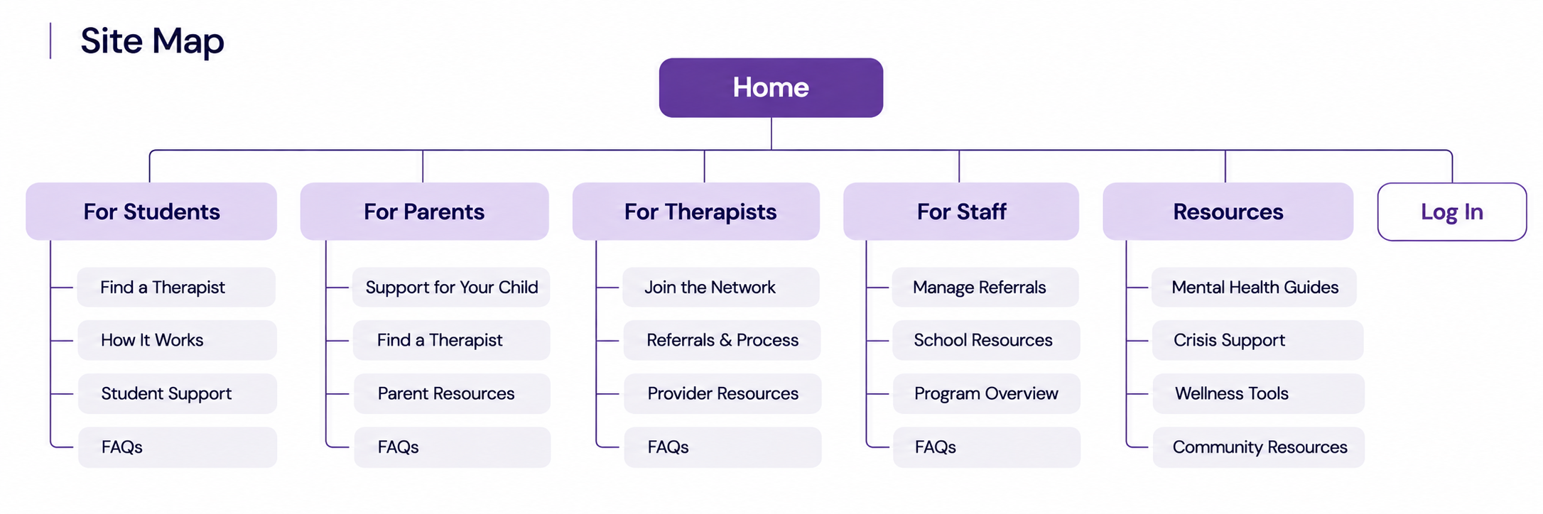
Site Map
Organizing the platform around the distinct needs of students, parents, therapists, and staff, with clear pathways to relevant support, information, and resources.
Exploring Layout and Navigation
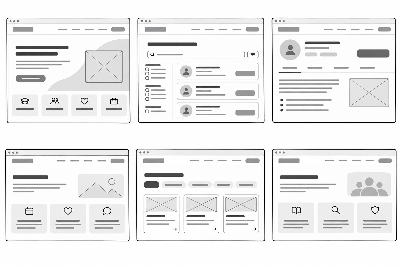
We explored early wireframe concepts to evaluate how content, navigation, and key features could be organized. These explorations helped shape a clearer, more intuitive experience for HelloHero's different user groups.
Conceptual WireframesClearer Navigation
Simplified navigation to help users find their way through the platform.
Better Content Organization
Structured information to make relevant resources easier to locate.
More Intuitive User Pathways
Clarified the steps users take to navigate the experience and access services.
More Accessible Information
Improved content clarity and presentation to make information easier to understand and use.
Key Improvements
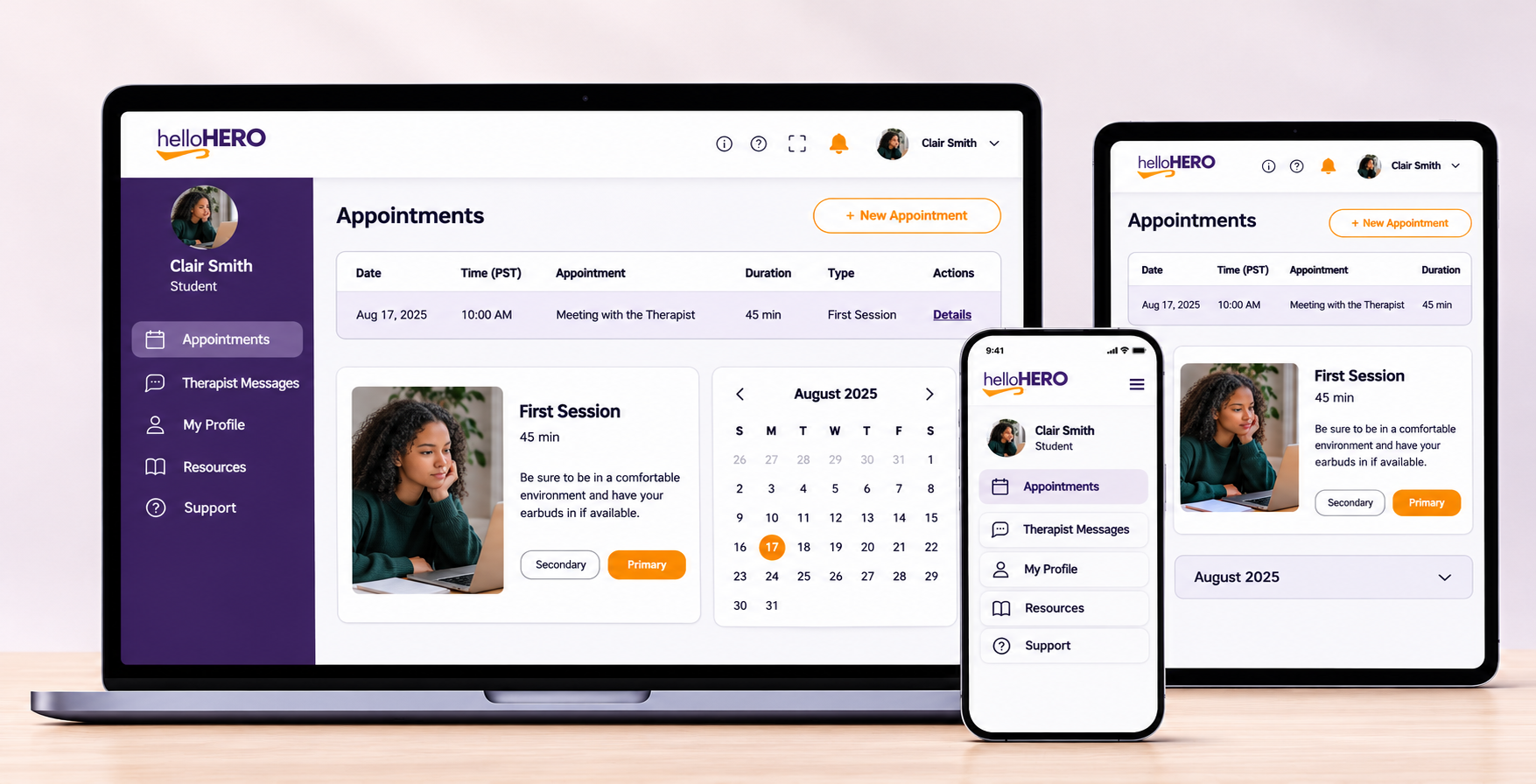
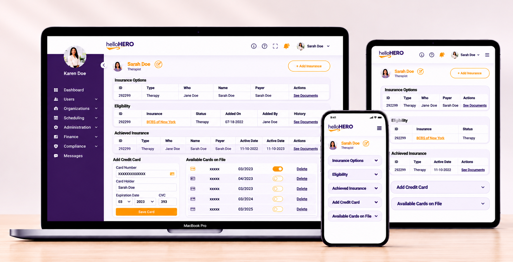
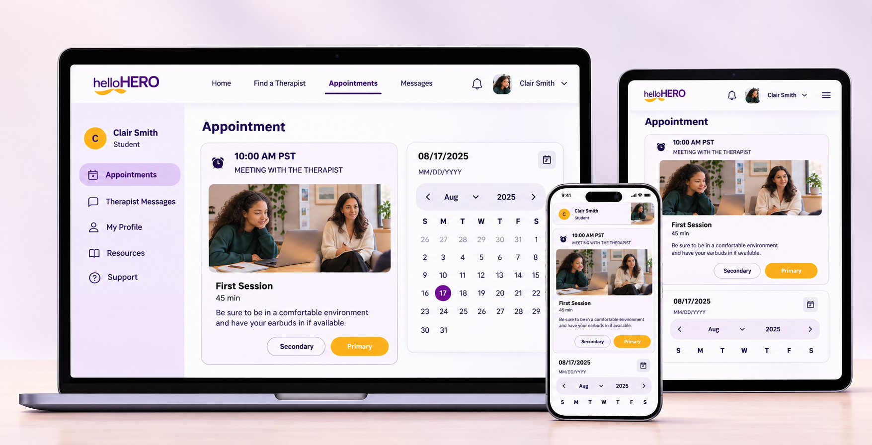
The Final Design
A cleaner, more approachable experience that guides users to support.
The refined HelloHero experience brings together clearer navigation, organized content, and a more approachable interface to help users find and access therapy services.
Designed for desktop, tablet, and mobile, the responsive experience provides a consistent way to navigate appointments, connect with therapists, and access support resources.
Improving the Experience Through Thoughtful Design
The refined HelloHero experience brings greater clarity and consistency to a platform serving students, families, therapists, and staff. By drawing on existing research and prioritizing usability improvements, I helped shape a more intuitive interface and prepared responsive designs for developer handoff.
This project reinforced the value of thoughtful, user-centred design: meaningful improvements don't always require building something new, but making an existing experience easier to navigate and understand.
Outcome and Reflection